Shakúff
Visual Identity
2021—2023
Services
Market
NY-based lighting design studio Shakúff entrusted us to take their identity from a start-up look and feel to that of an established international player in the field of luxury and bespoke lighting. We’ve rebuilt their brand from the ground up, starting with a new entirely bespoke word-mark, a state of the art website and online shop, visual content, taking their product presentation to the next level, and ultimately a comprehensive catalogue.
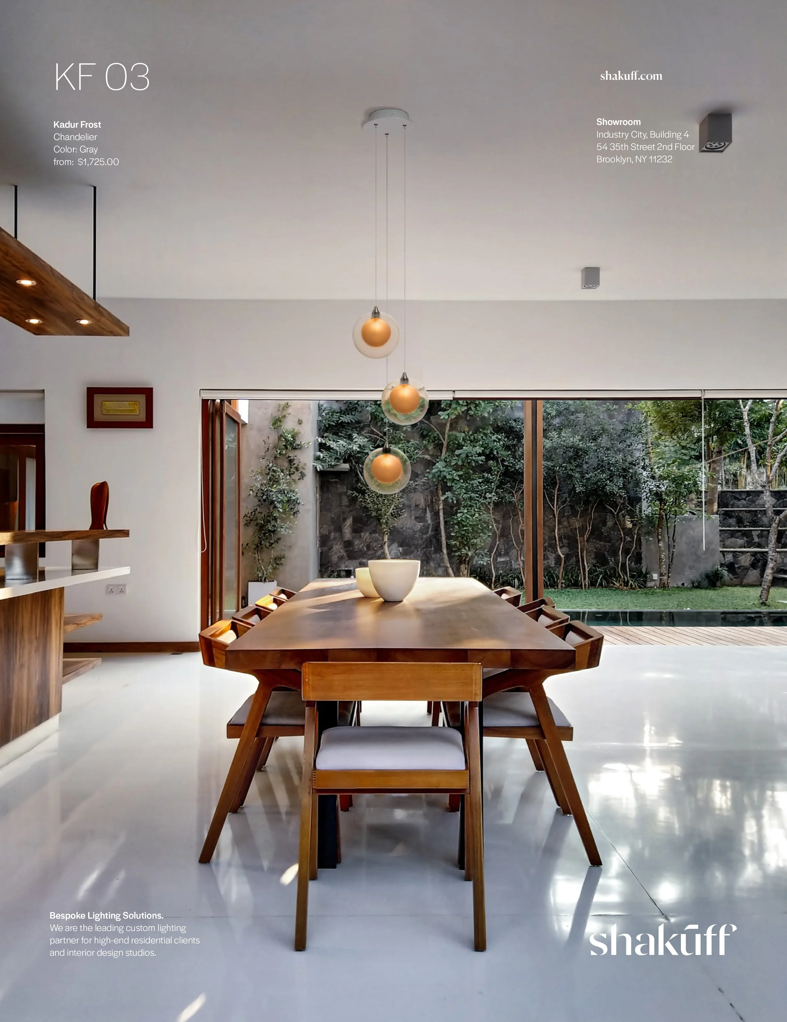
Taking proven design mechanics in the market, we built their visual identity around elevated usage of typography and white space centered compositions, resulting in pixel-perfect, non-templated designs for their website that put their products front and center. Directing product photography, we‘ve created a suite of assets for both their online shop, but also as a means to help us create custom CGI visuals, both photorealistic and deliberately creative, now rivaling the big players in their market.
Branding
Webdesign
UI/UX
Print
Illustration
CGI
Luxury
Design
Lighting


The Logo
Shakúff’s attention to detail, and often custom work for clients and architects is reflected in this entirely bespoke word mark that feels both classical and modern. Other elements were discarded in favor of giving the exotic brand name all the attention.

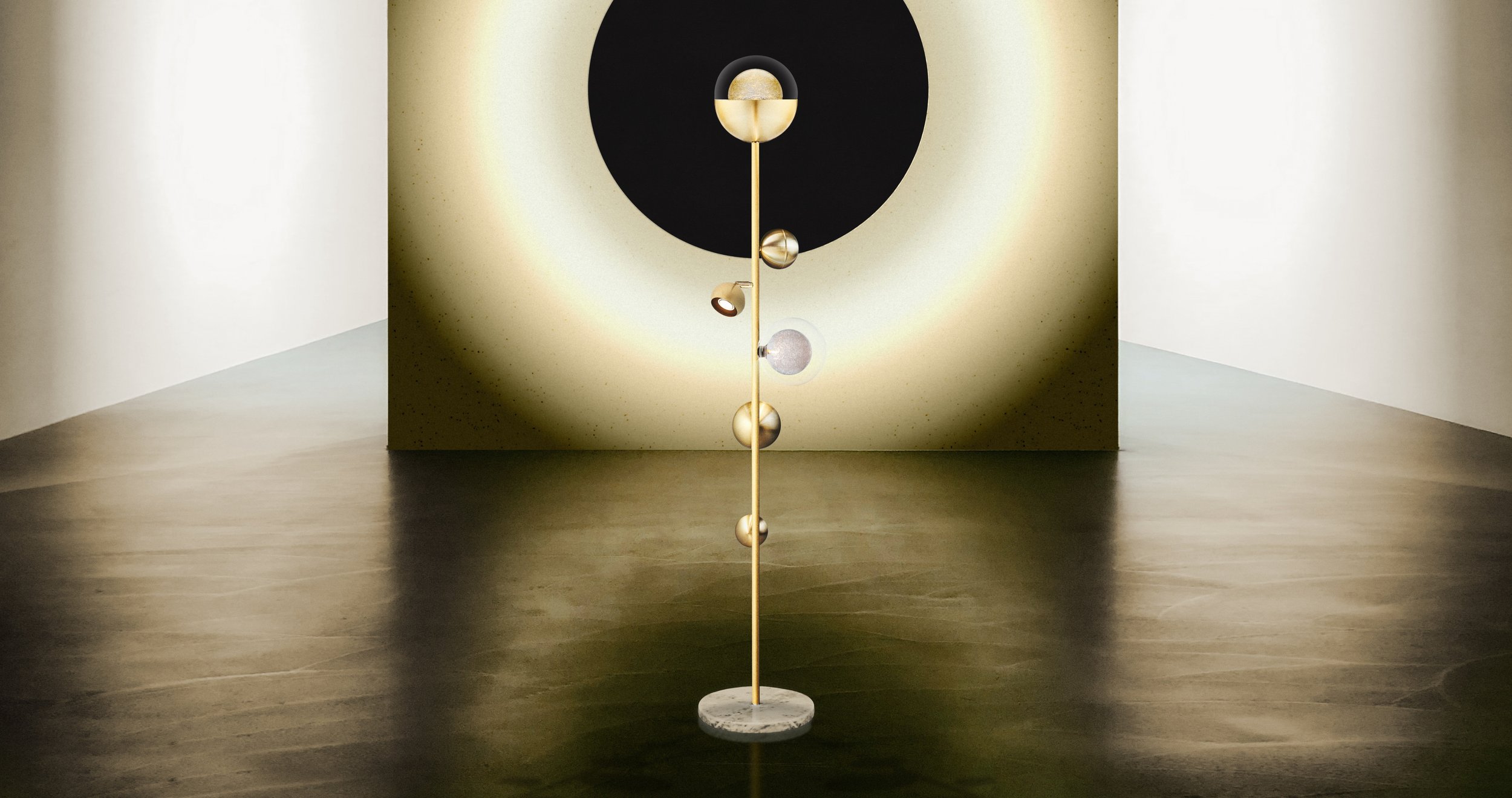
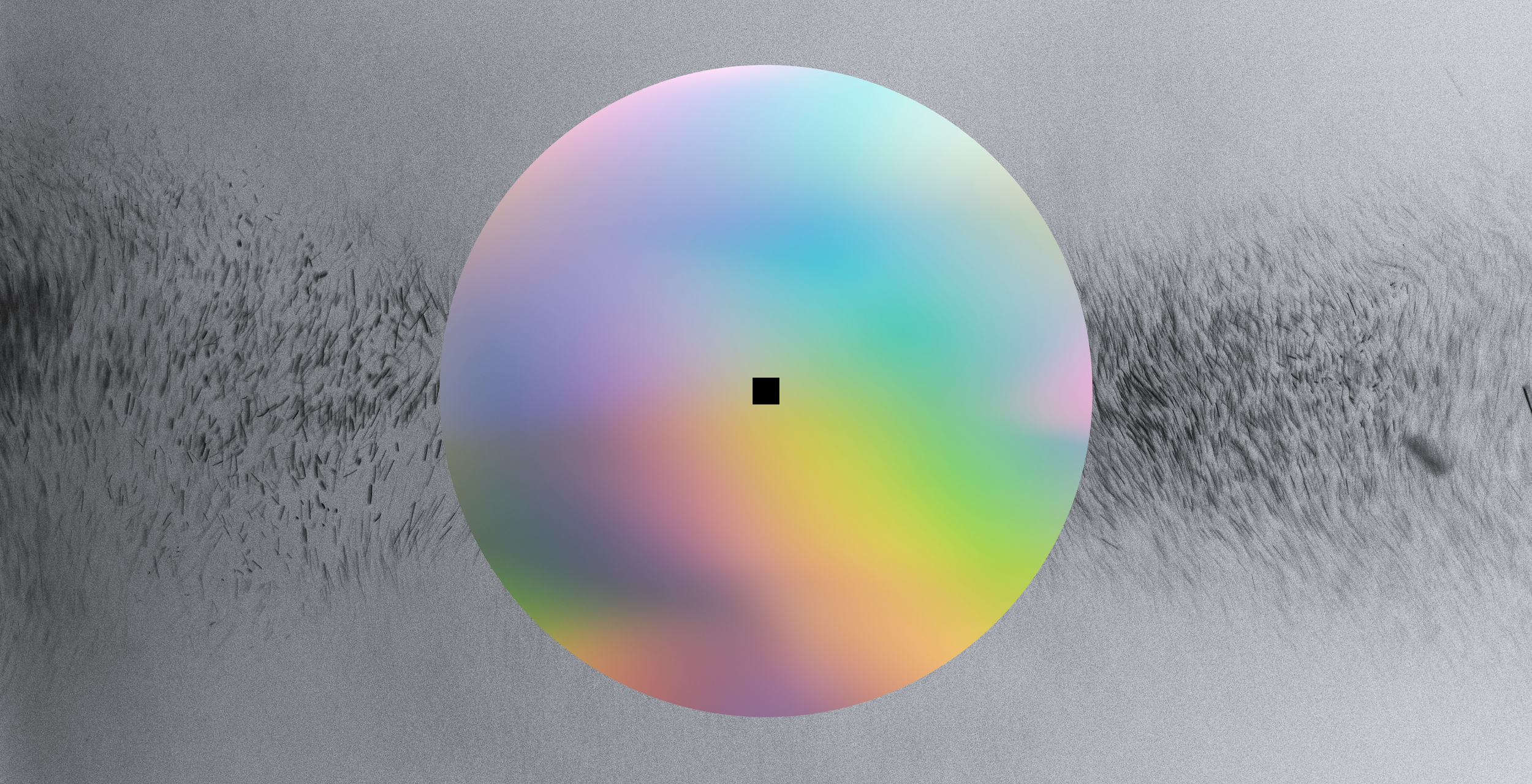
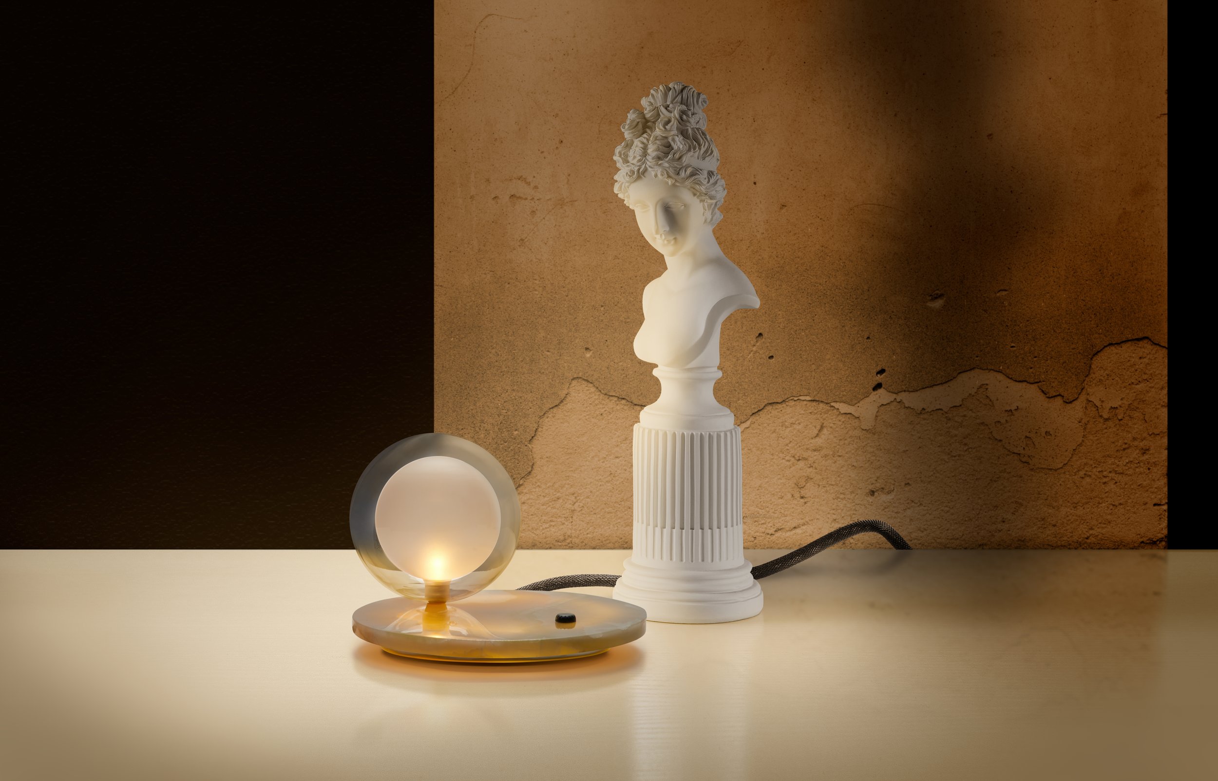
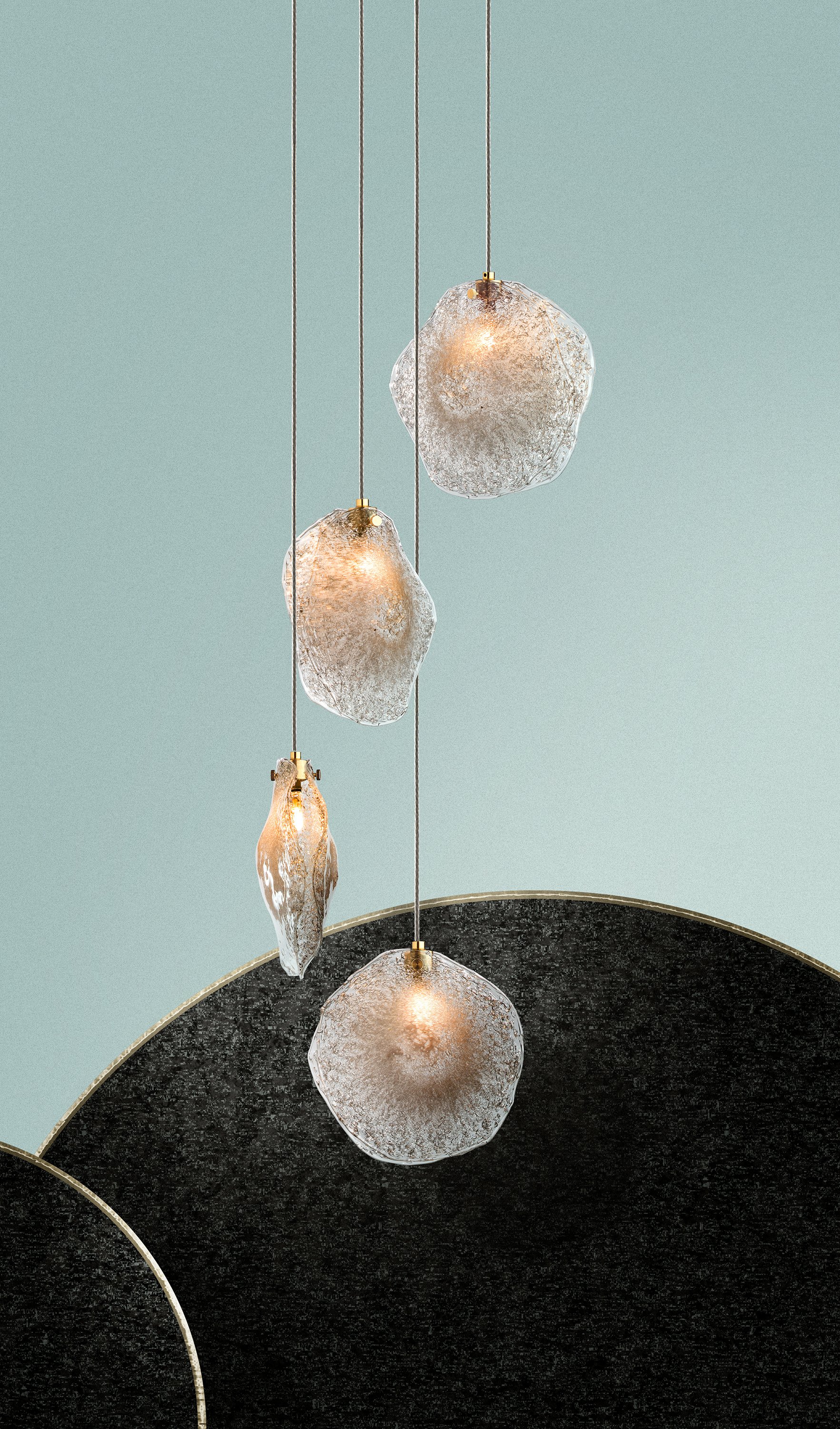
Bepsoke Visuals
One of our biggest challenges was to elevate the brands visual content — we utilized every resource at our disposal, from unsplash, to CGI and handmade collages to create iconic images on a limited budget.


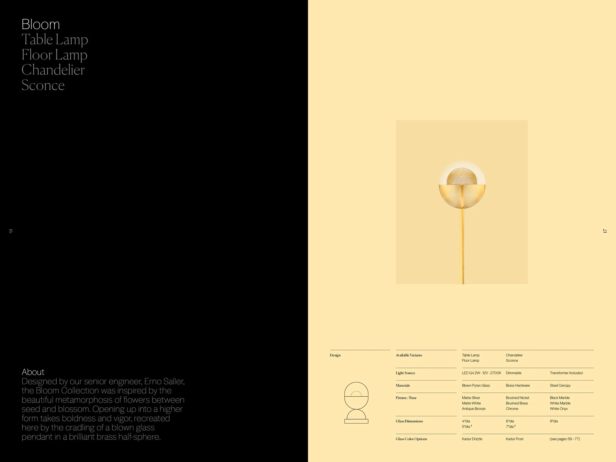
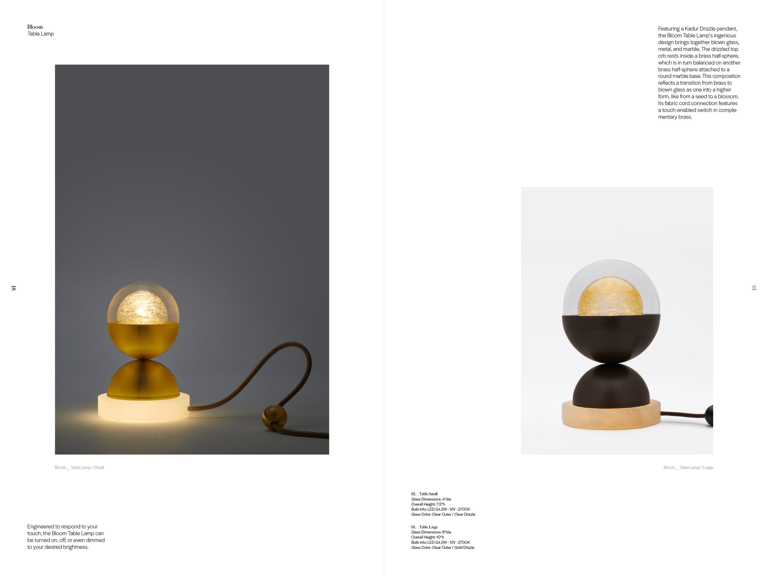
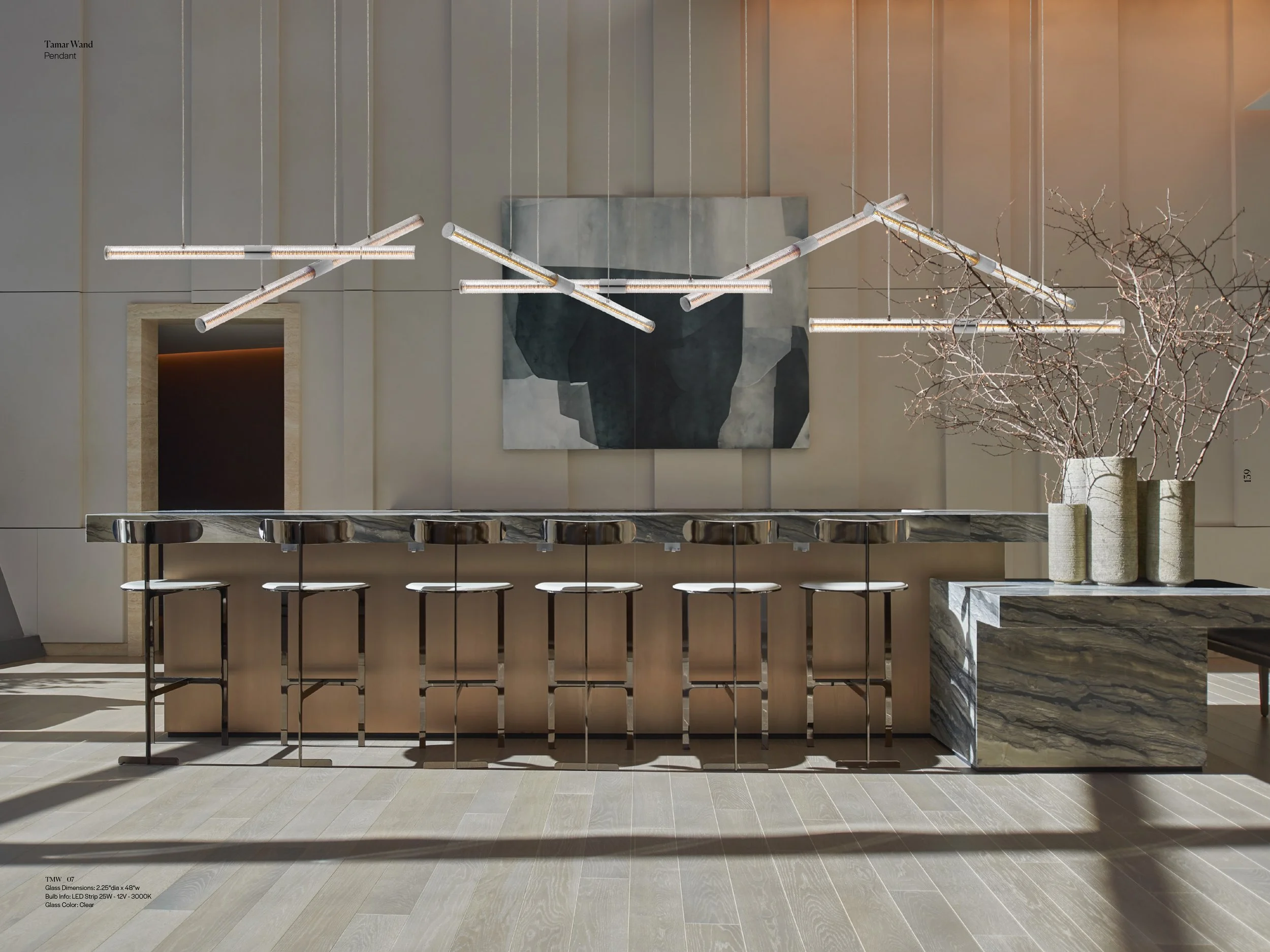
Catalogue
From concept to copy writing and from technical drawings to bespoke visuals we took care of every aspect of the brands first comprehensive 180 page catalogue.

Cover
We used a subtle and clean approach, using de-bossing and UV spot gloss finishing with custom applied embossed golf-foil stickers

Selected Spreads
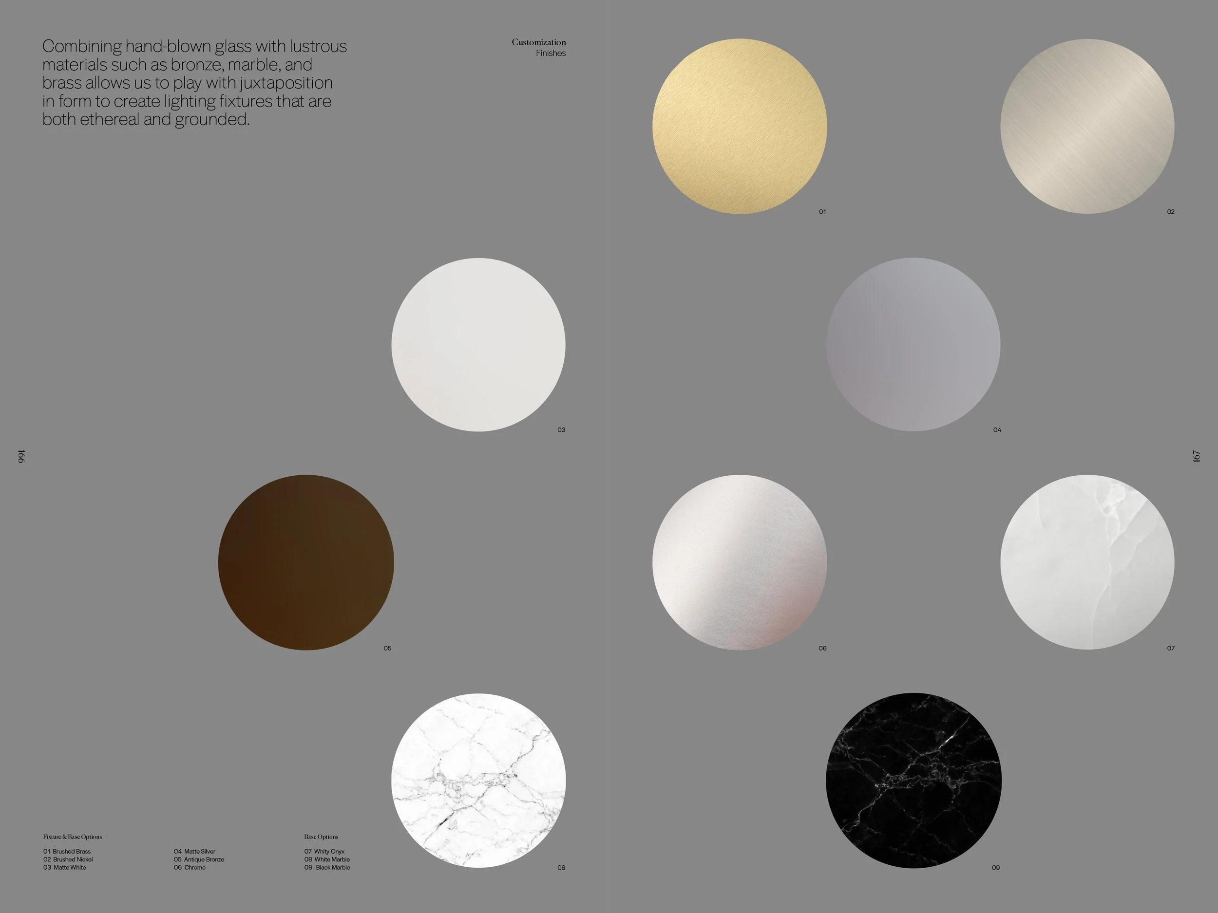
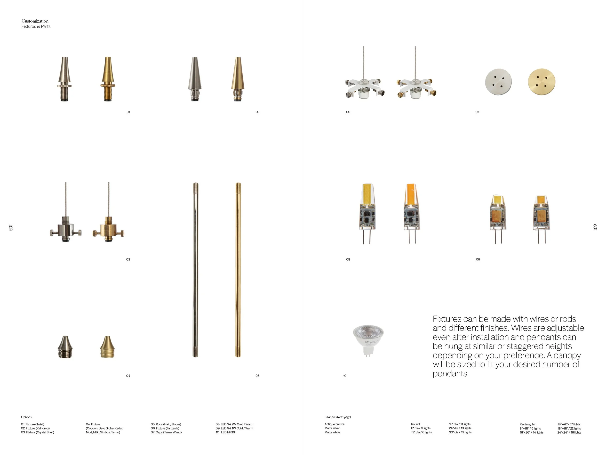
We made use of a flexible grid, generous white space and understated typography, alongside dynamic colors that help us set the tone for different products.


Ad system
Clarity, flexibilty and lightness in composition allows us to put the full emphasis on both the visual assets as well as the brand name.
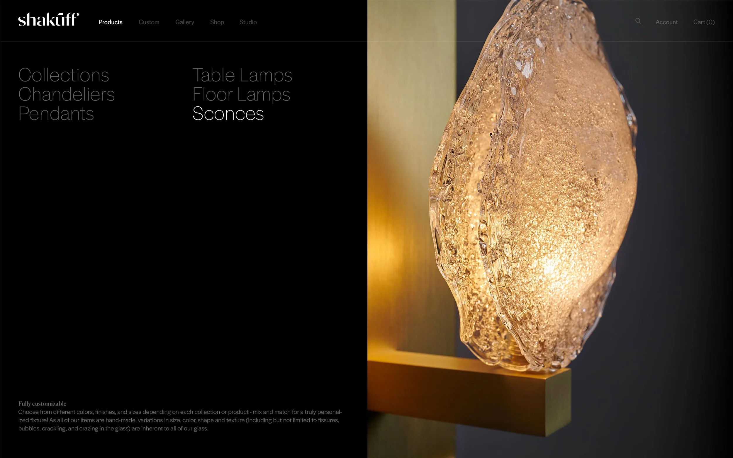
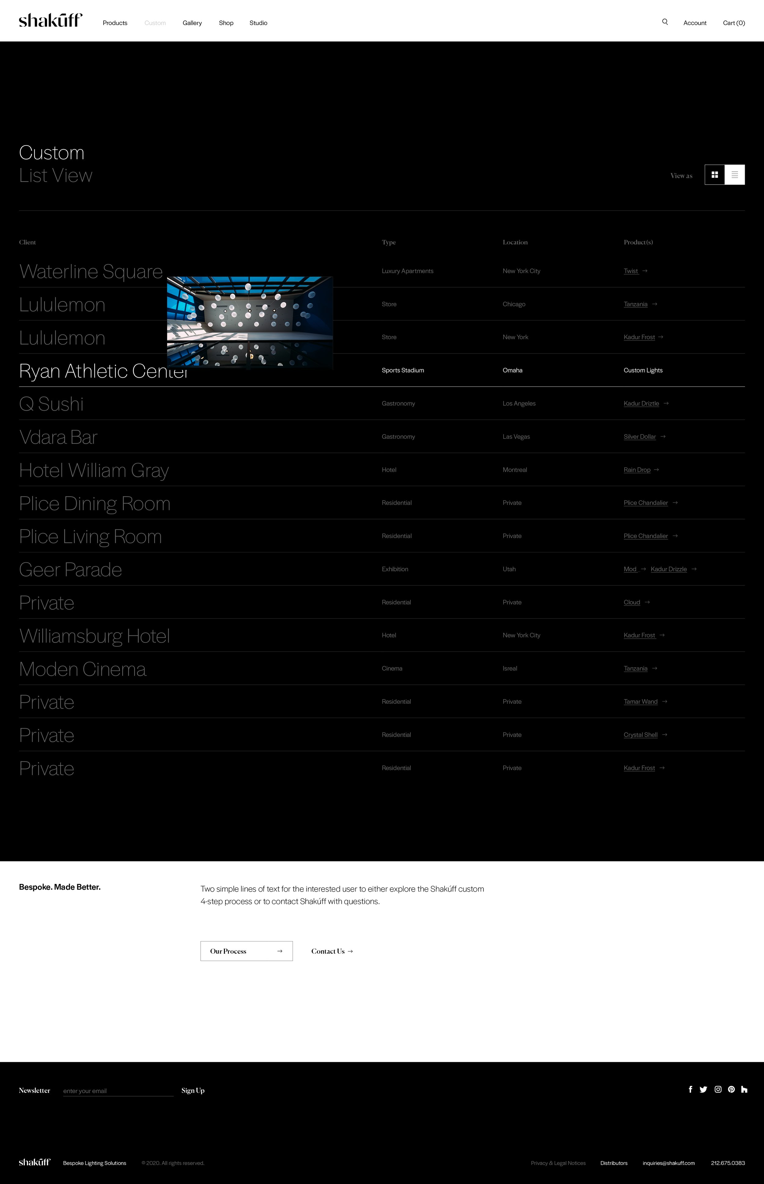
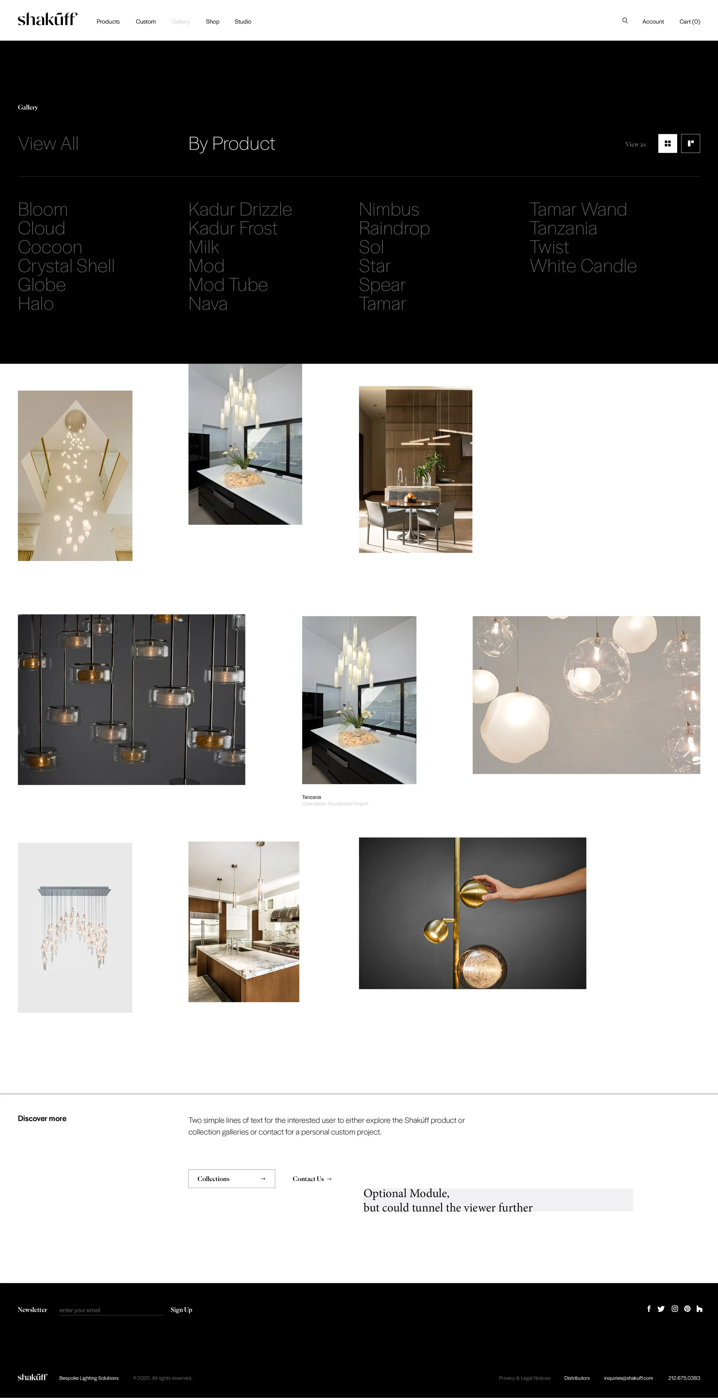
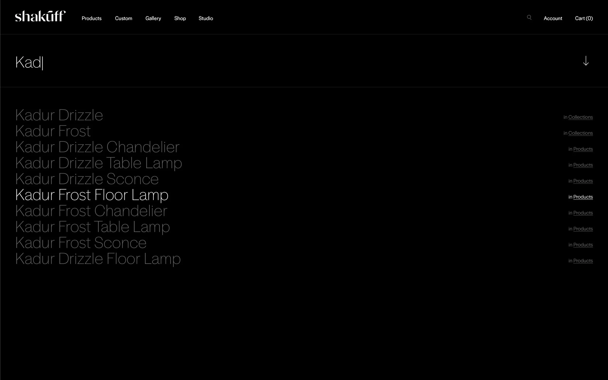
Website
After defining the visual identity and tackling UX, we took Shopify to its limits — elaborate grids and carefully designed responsive layouts provide a luxurious and clean experience across all devices.


Selected Spreads
We made use of a flexible grid, generous white space and understated typography, alongside dynamic colors that help us set the tone for different products.