Susanne Hartlieb
Brand Identity | Packaging
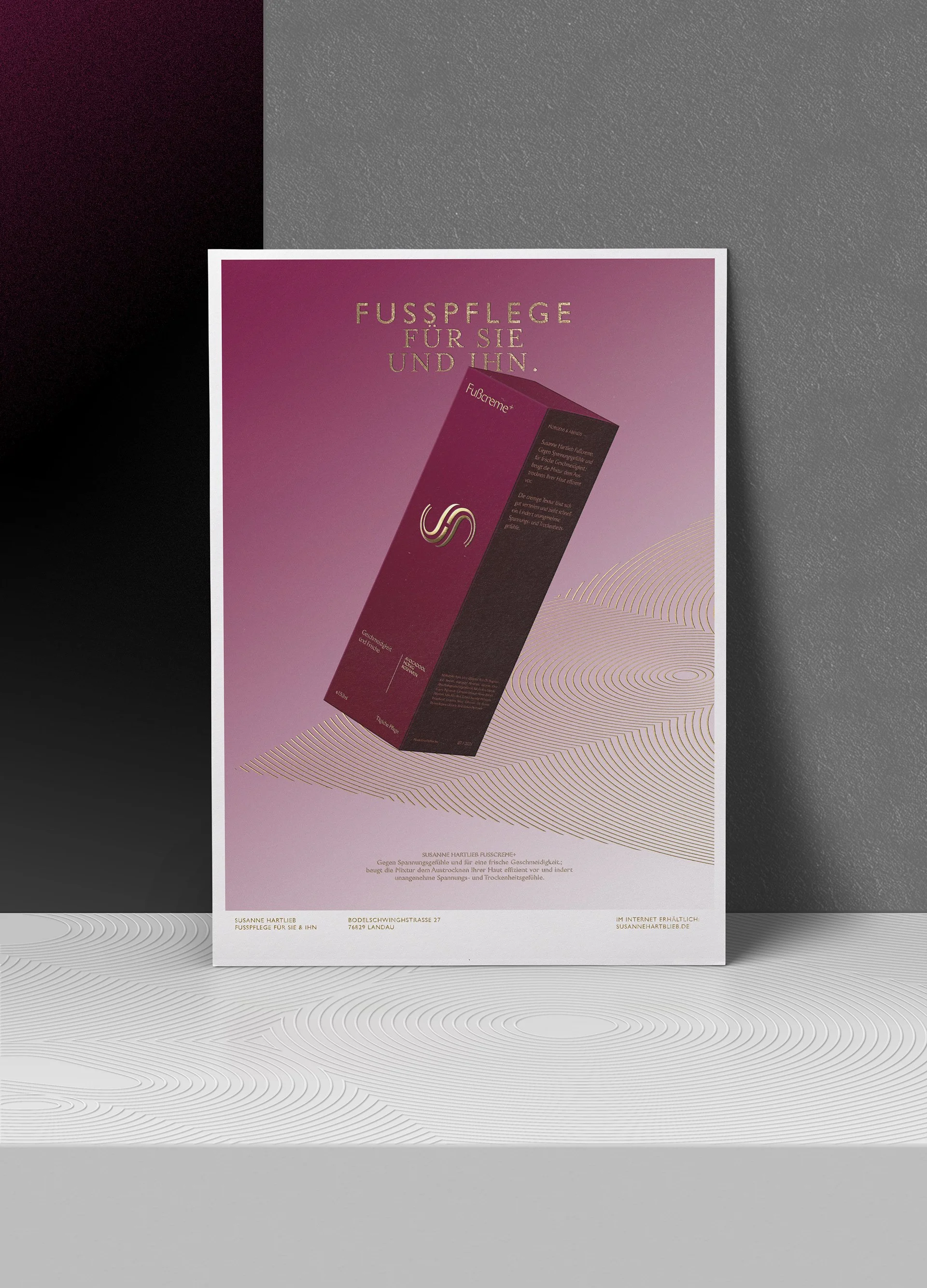
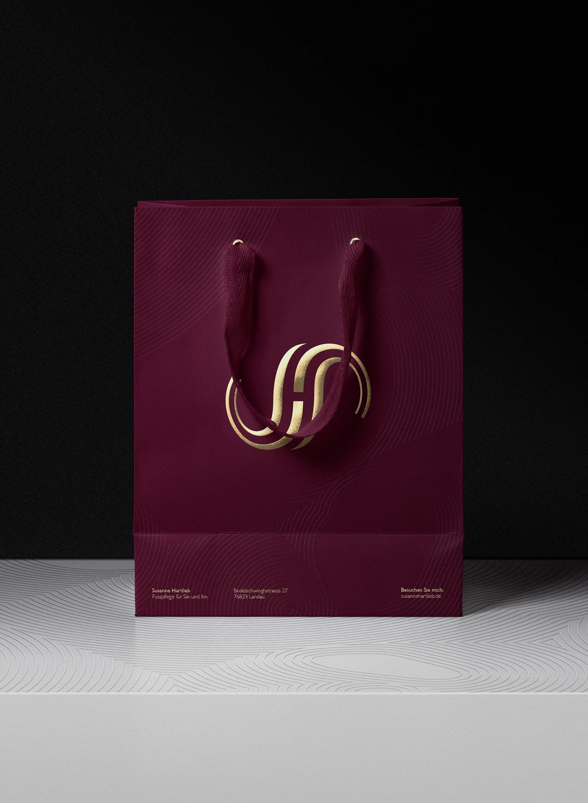
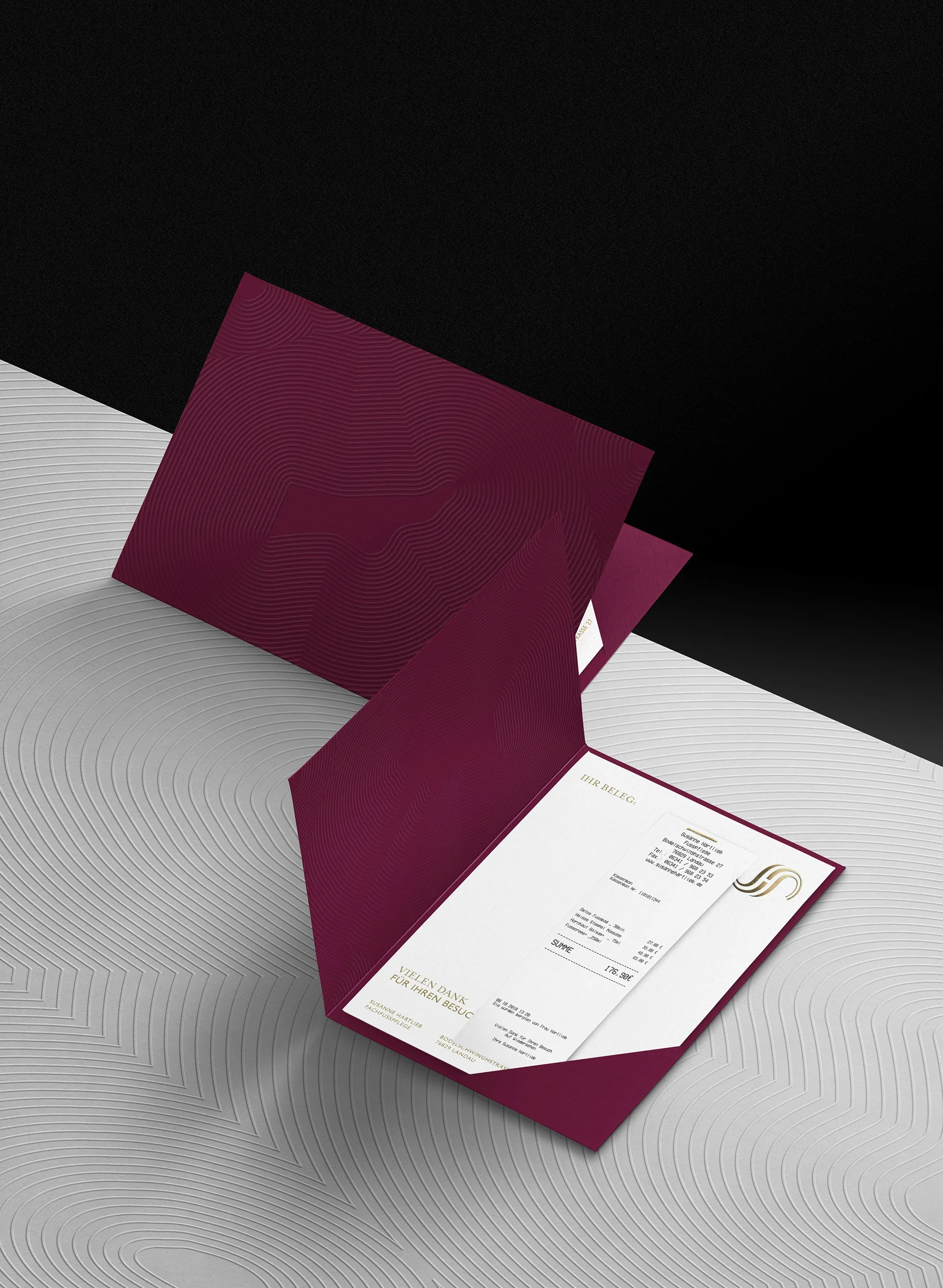
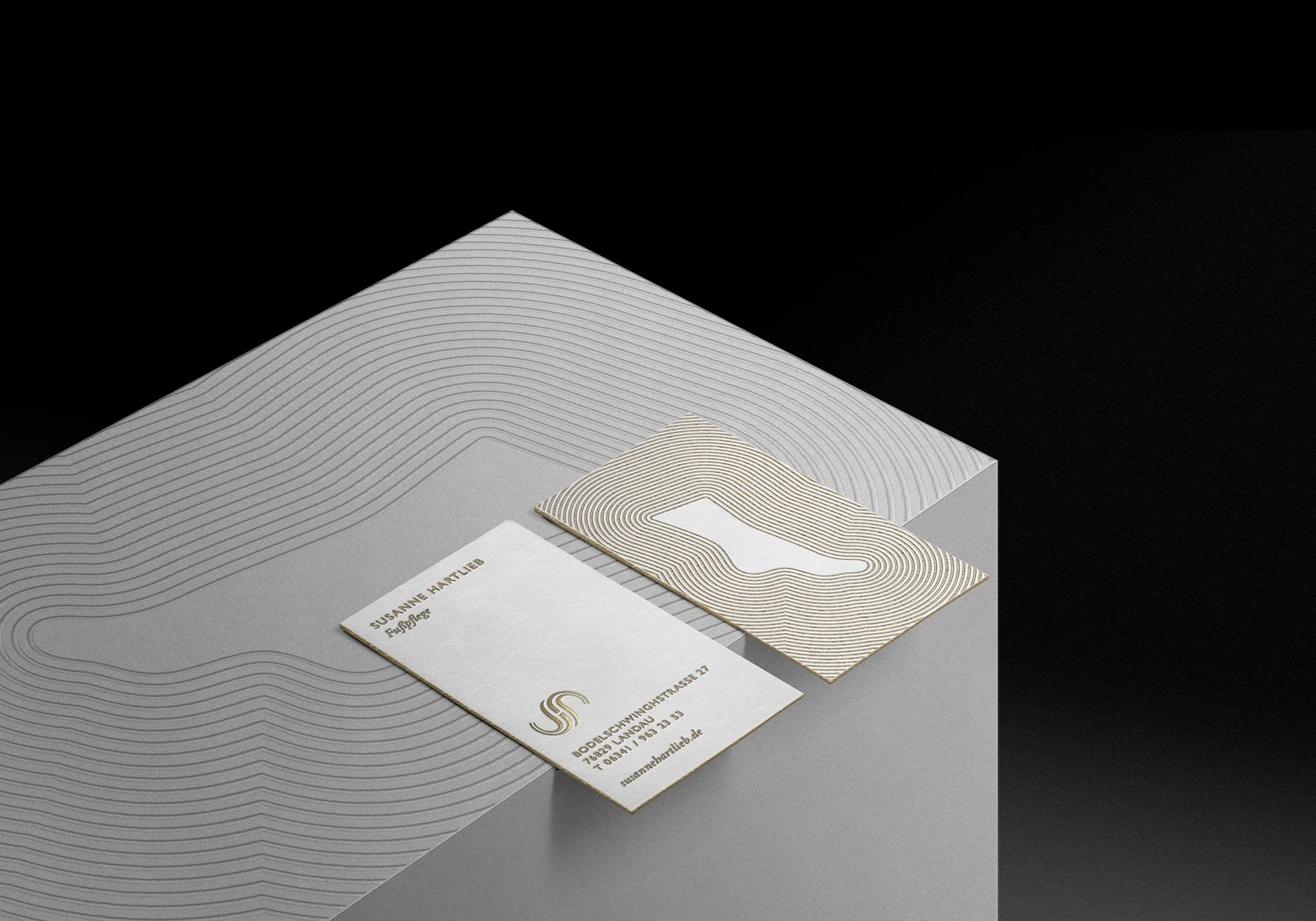
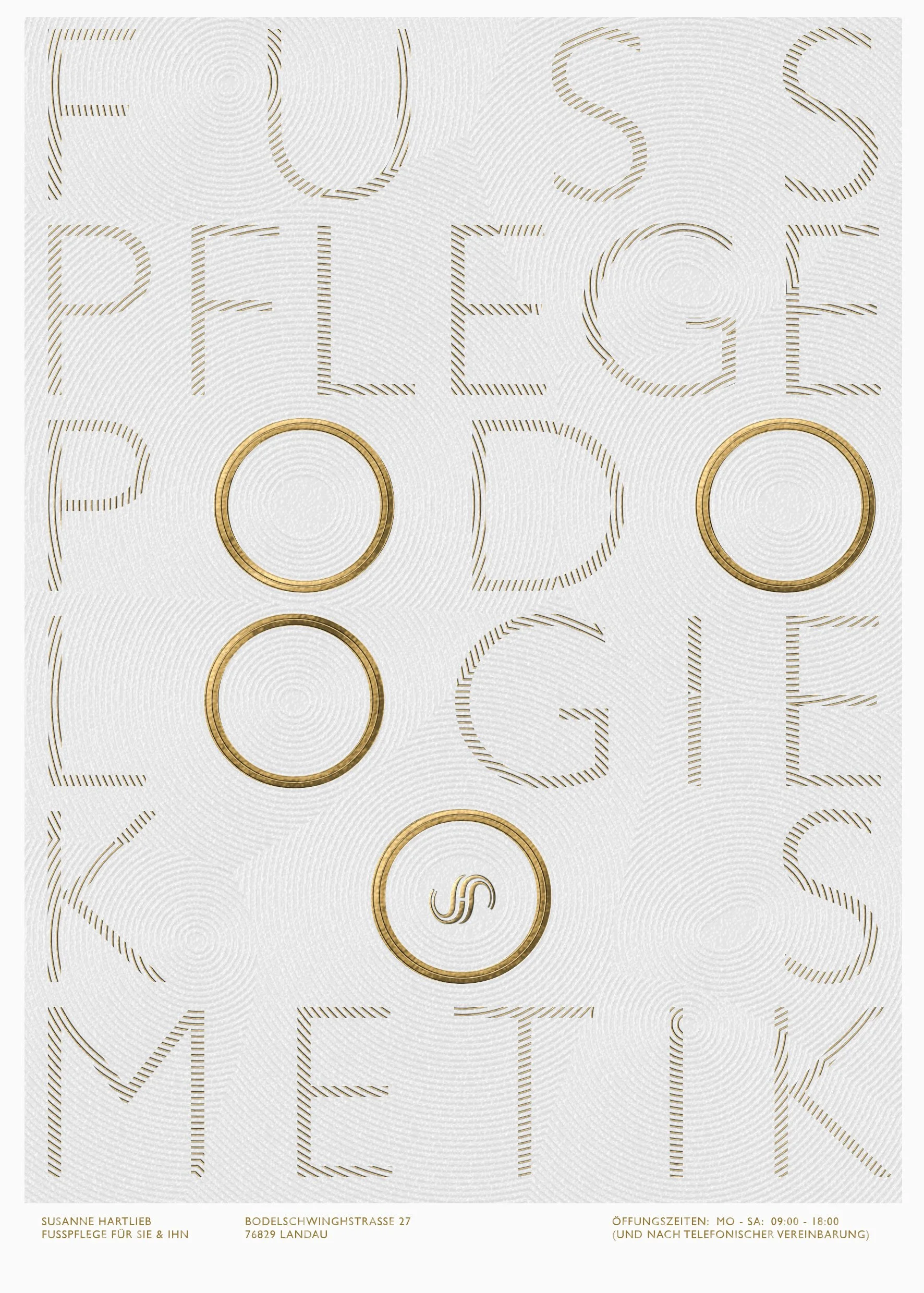
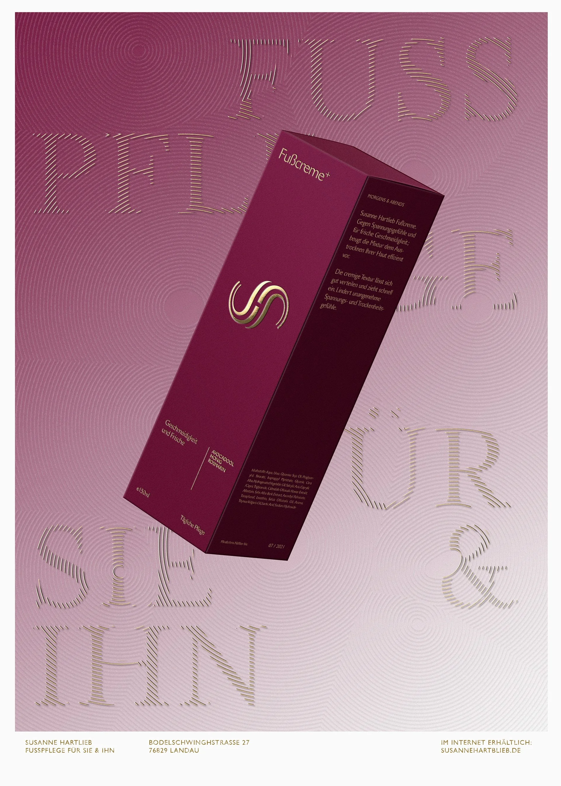
From a bespoke monogram, a rich and indulgent visual branding to an overarching creative concept inspired by zen gardens, we’ve developed various print collaterals, packaging designs and more for a boutique podology institute in Germany.

The Concept
We were inspired by the calm and care found in a typical zen garden and derived both a logo and a visual concept from the delicate raking of sand; Translating the attention to detail and goal of establishing harmony for the client and health of their feet, the visual concept also radiates softness and elegance. It also enabled the branding to work without the touchy subject of having relatable foot photography as part of the formula.
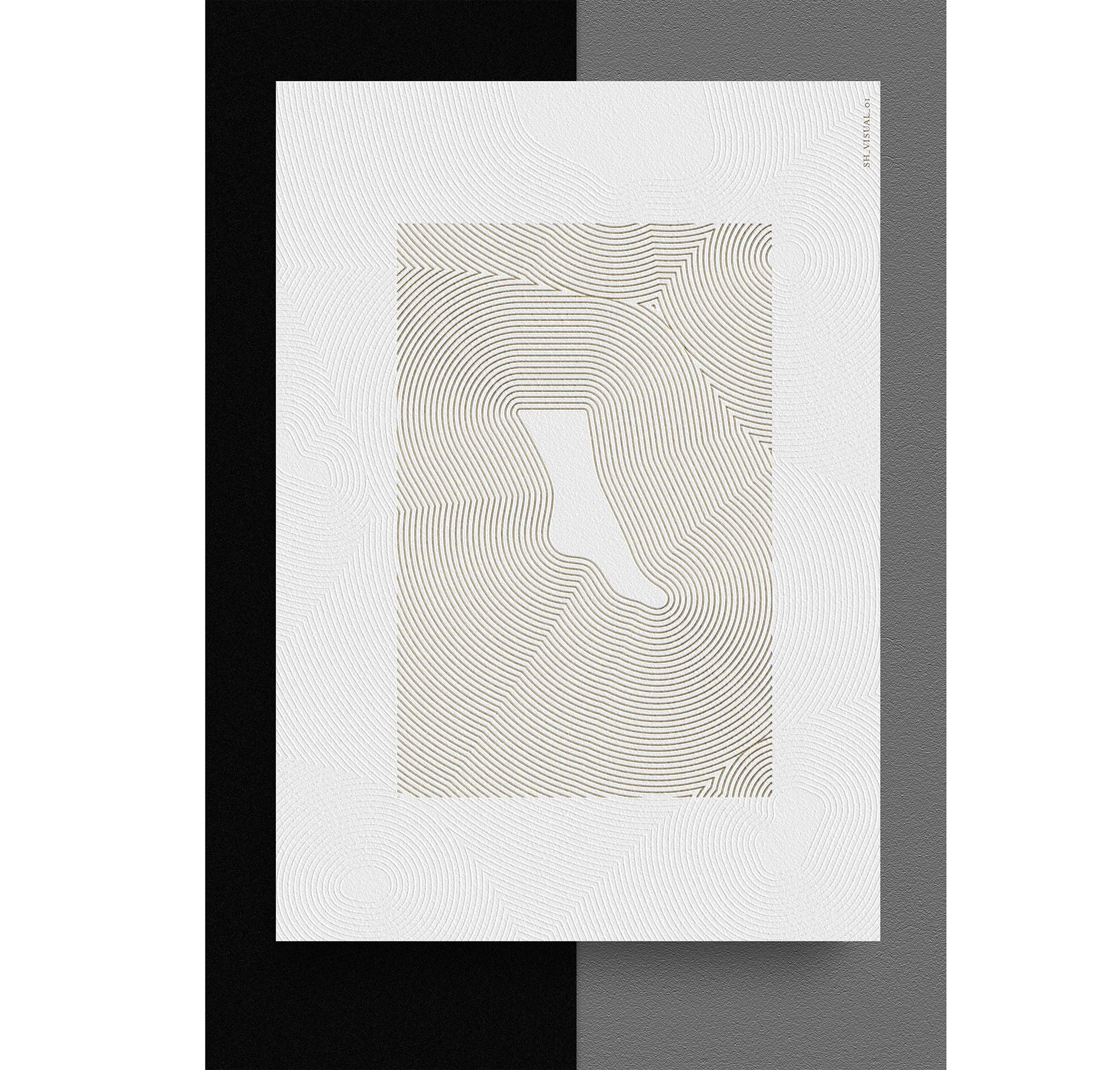
The Concept