Branding, Packaging, Web Design
2024
Preston Herb Company
Services
Market
Branding
Packaging
Webdesign
Recreational Cannabis
Wellness
Lifestyle
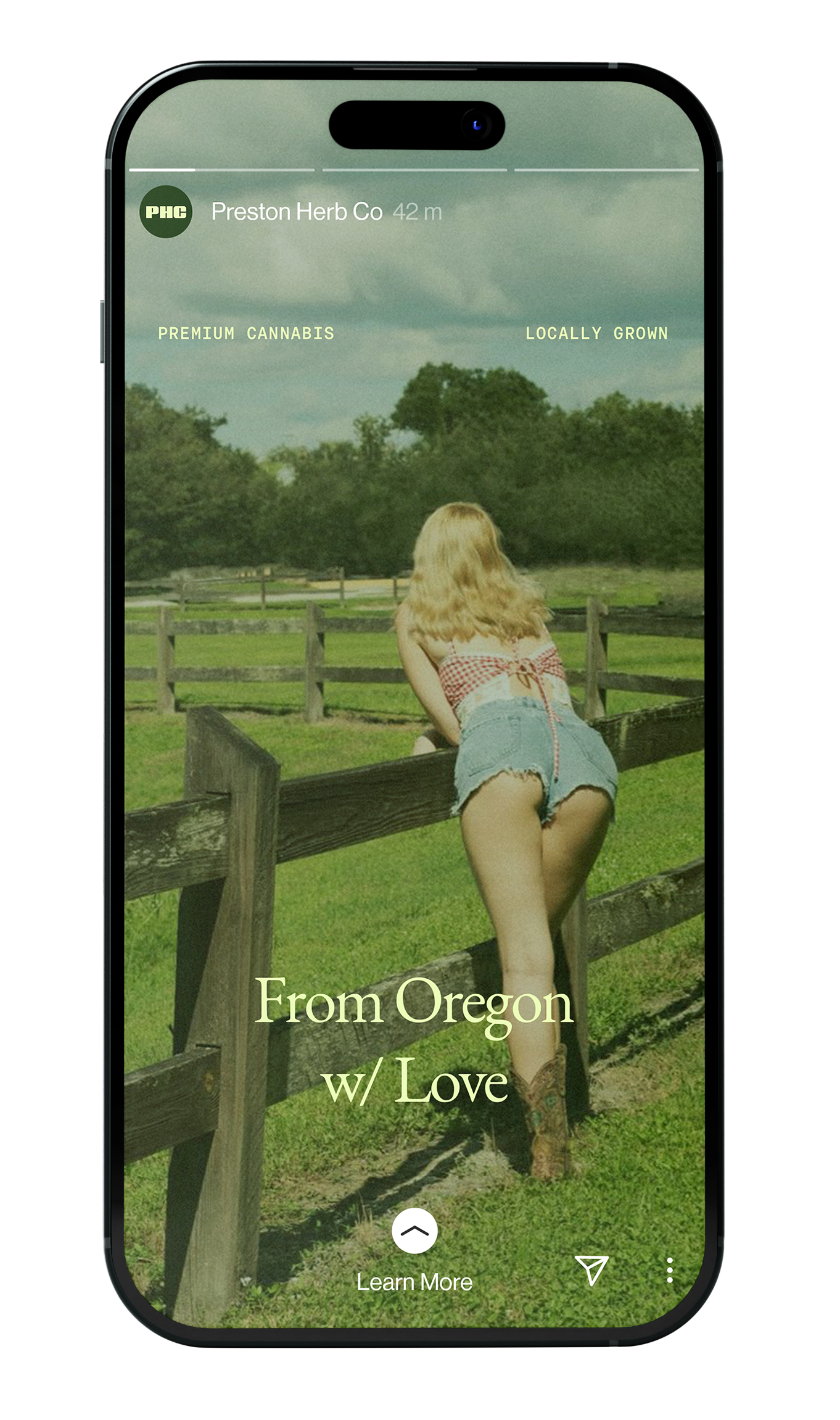
Preston Herb Company, aka PHC, is a recreational cannabis company based out of Oregon, United States. We were entrusted to take them from a bare-bones homemade brand, to a professional player in their field. In an exercise in balancing premium design with a touch of grunge, we landed on a lo-fi visual language with industrial and vintage elements, creating a unique vibe, driven by a distinct color palette and reflected in their new website, socials and product offerings.
Visual Identity
We have defined the PHC brand as both boutique, human and premium. This balance is achieved through a strong brand recognition via the wordmark and an immersive, slightly psychedelic and personal story telling via the visual content and an understated and lo-fi approach to typography.


Visual Content
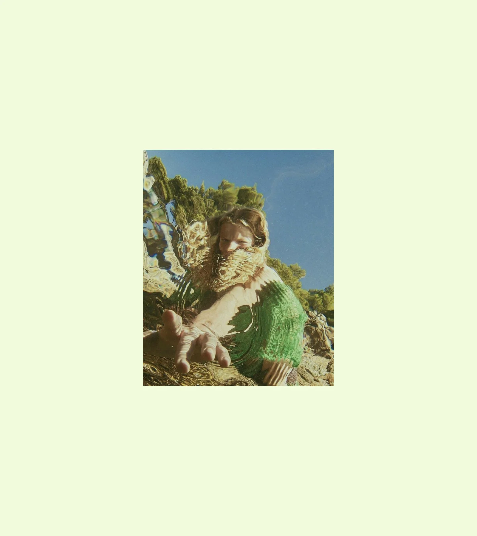
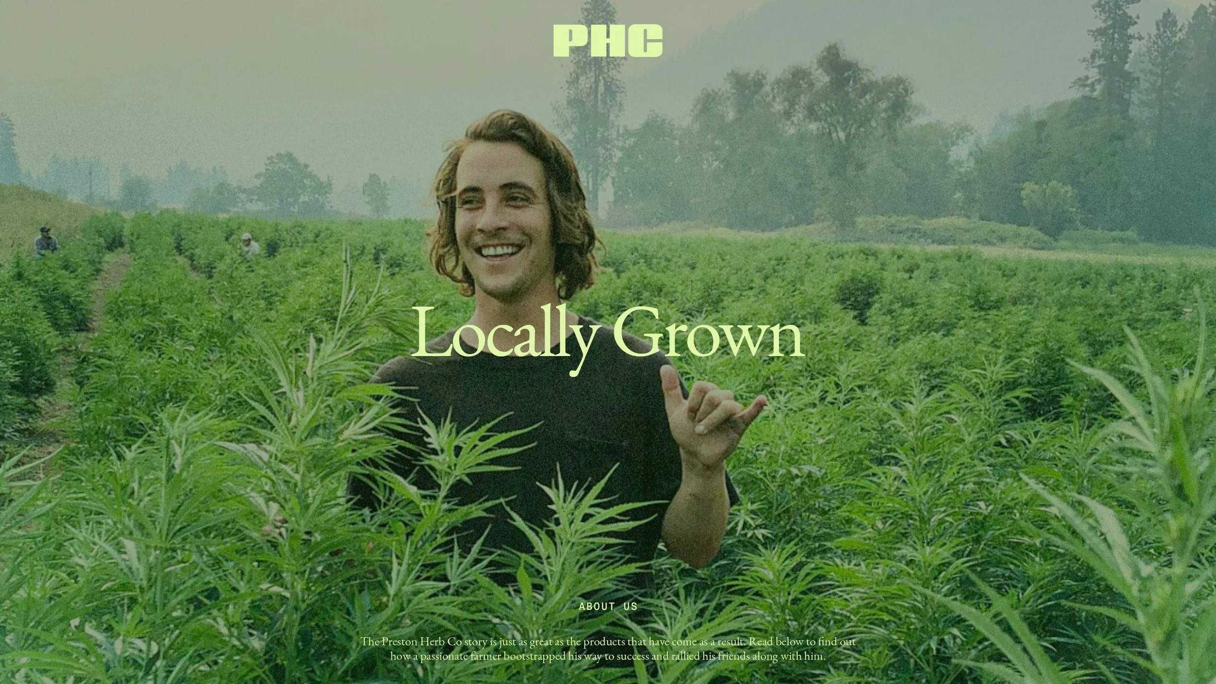
Our photography style can be roughly described as a vintage, polaroid, faded and discolored, country stoner vibe, that blends with the 3 shades of green that are defining t and capturing the spirit behind the brand.
Typography
Pairing a vintage serif with an industrial mono-spaced typeface and playing with deliberate imperfections in letter spacing and line height our lo-fi approach to the brand is continued.

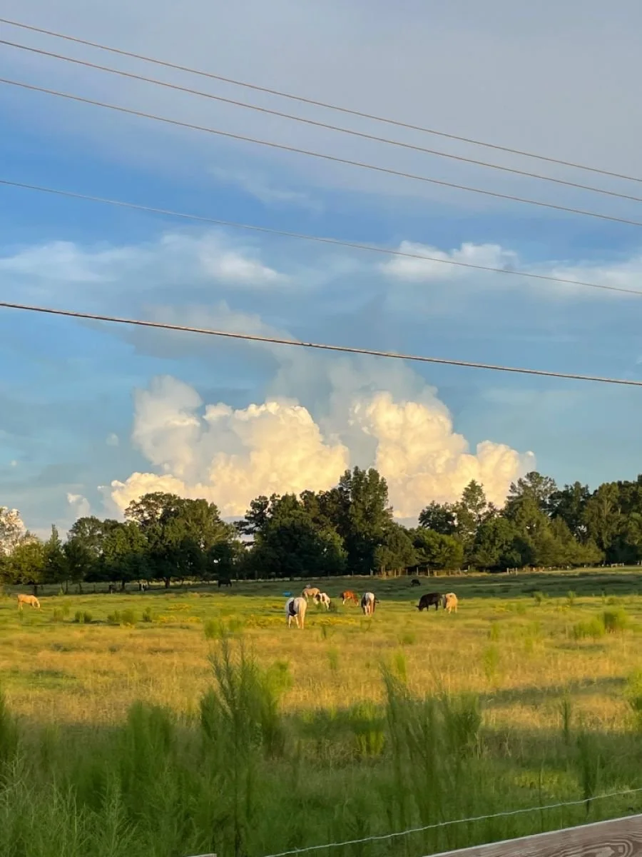
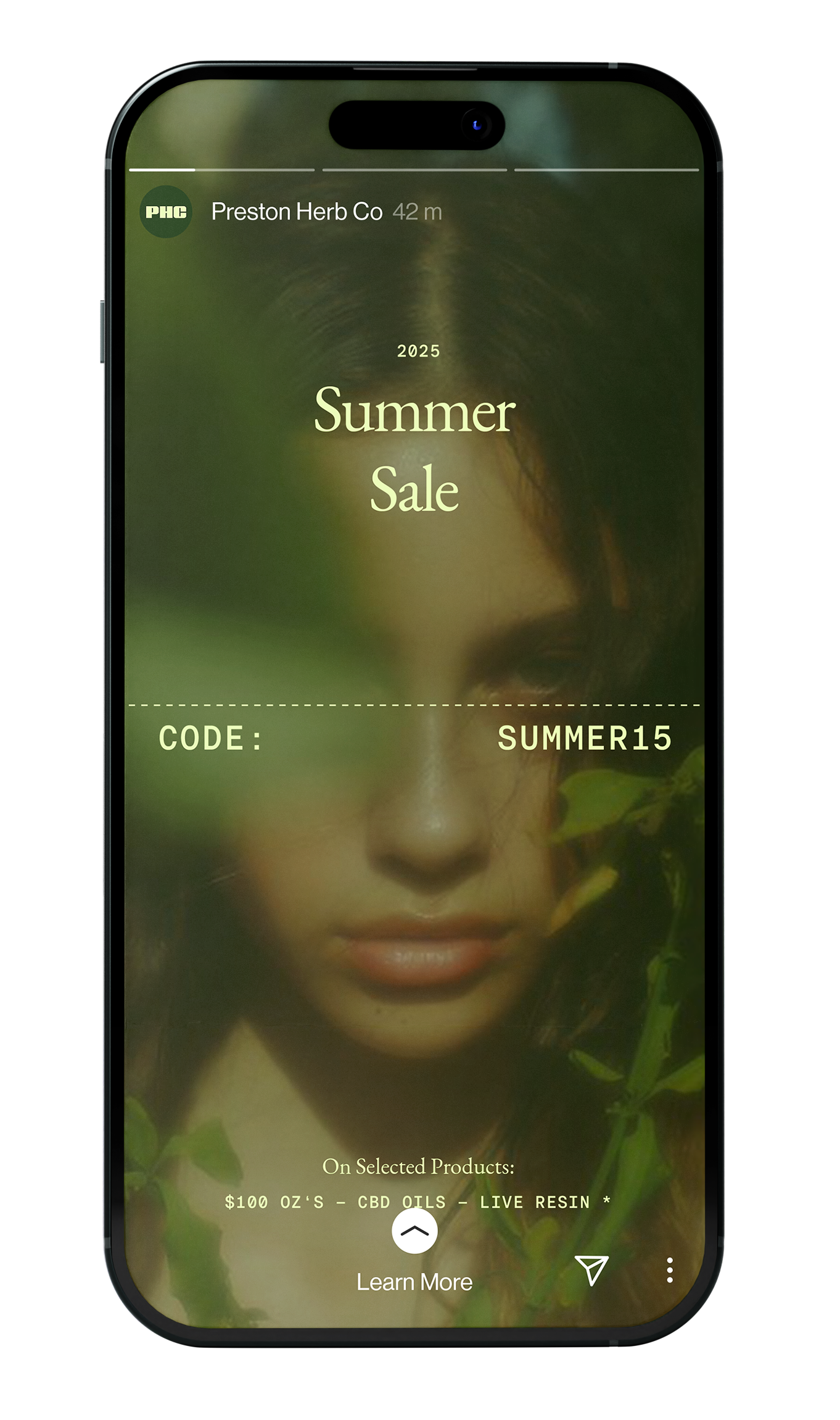
That Summer Vibe
You and your friends getting lost in nature on a fine summer day — it’s that immersive, unplugged and warm experience radiating from our curated visual photography.
Execution is Everything.
A simple palette ,understated fonts and a minimalist architecture leave no place to hide and everything up to composition and proportions.

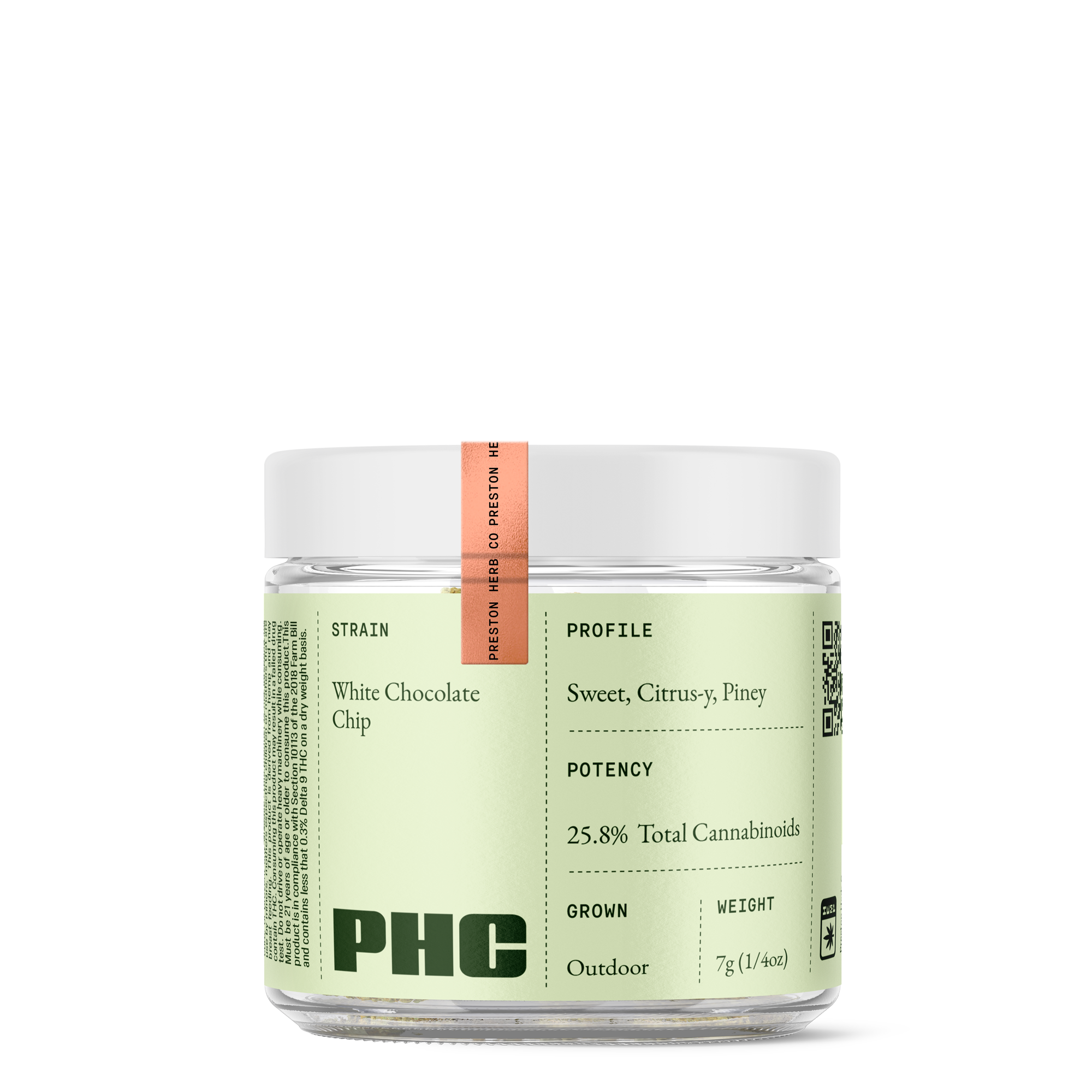
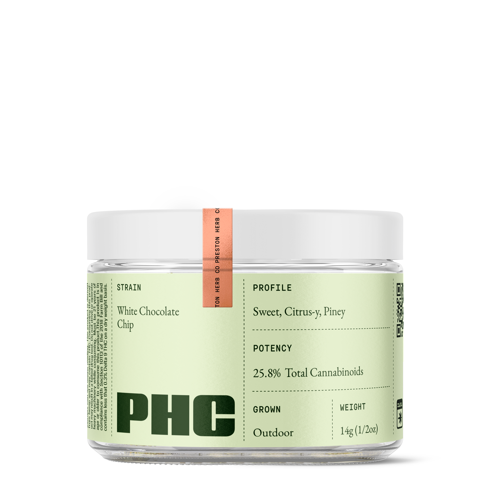
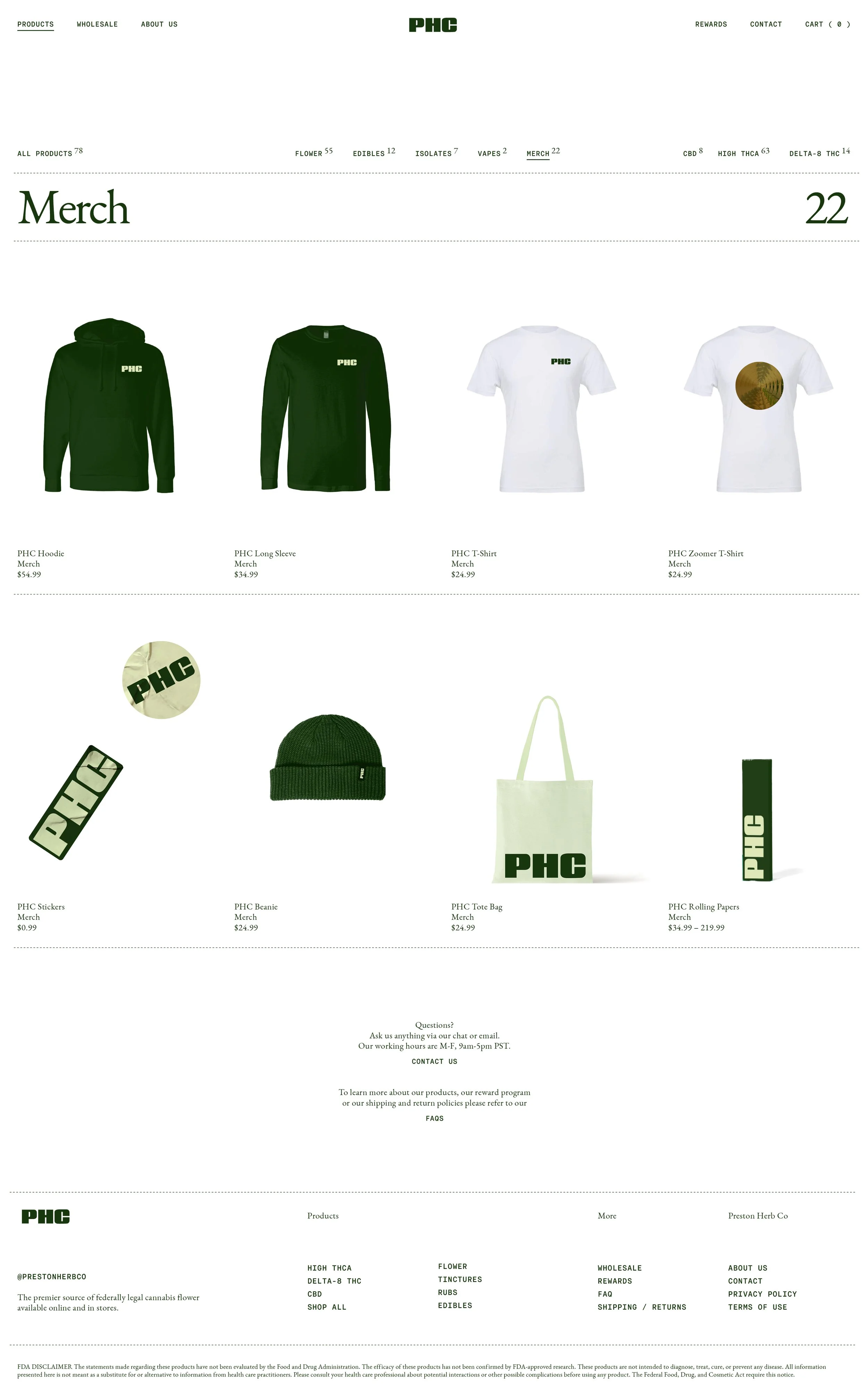
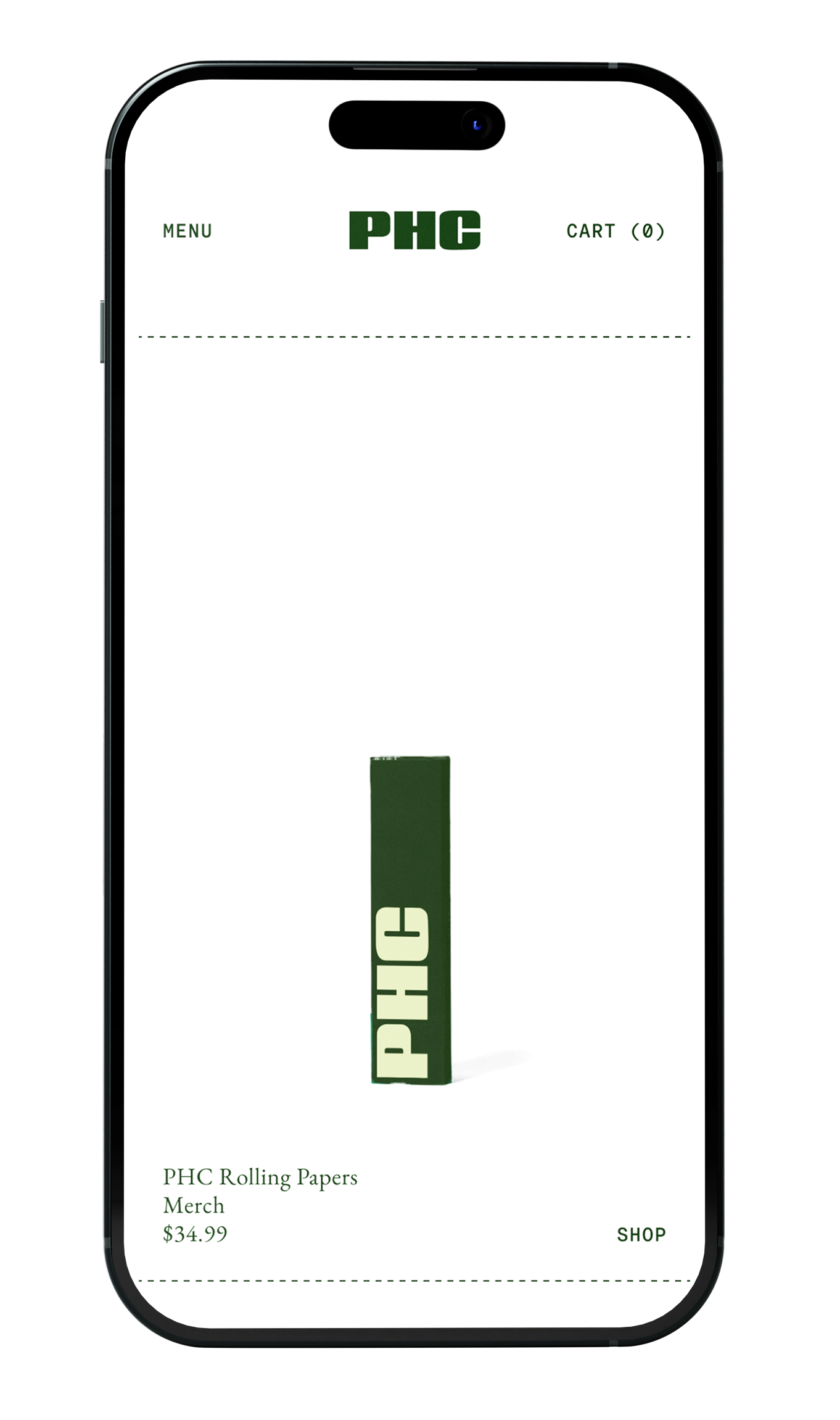
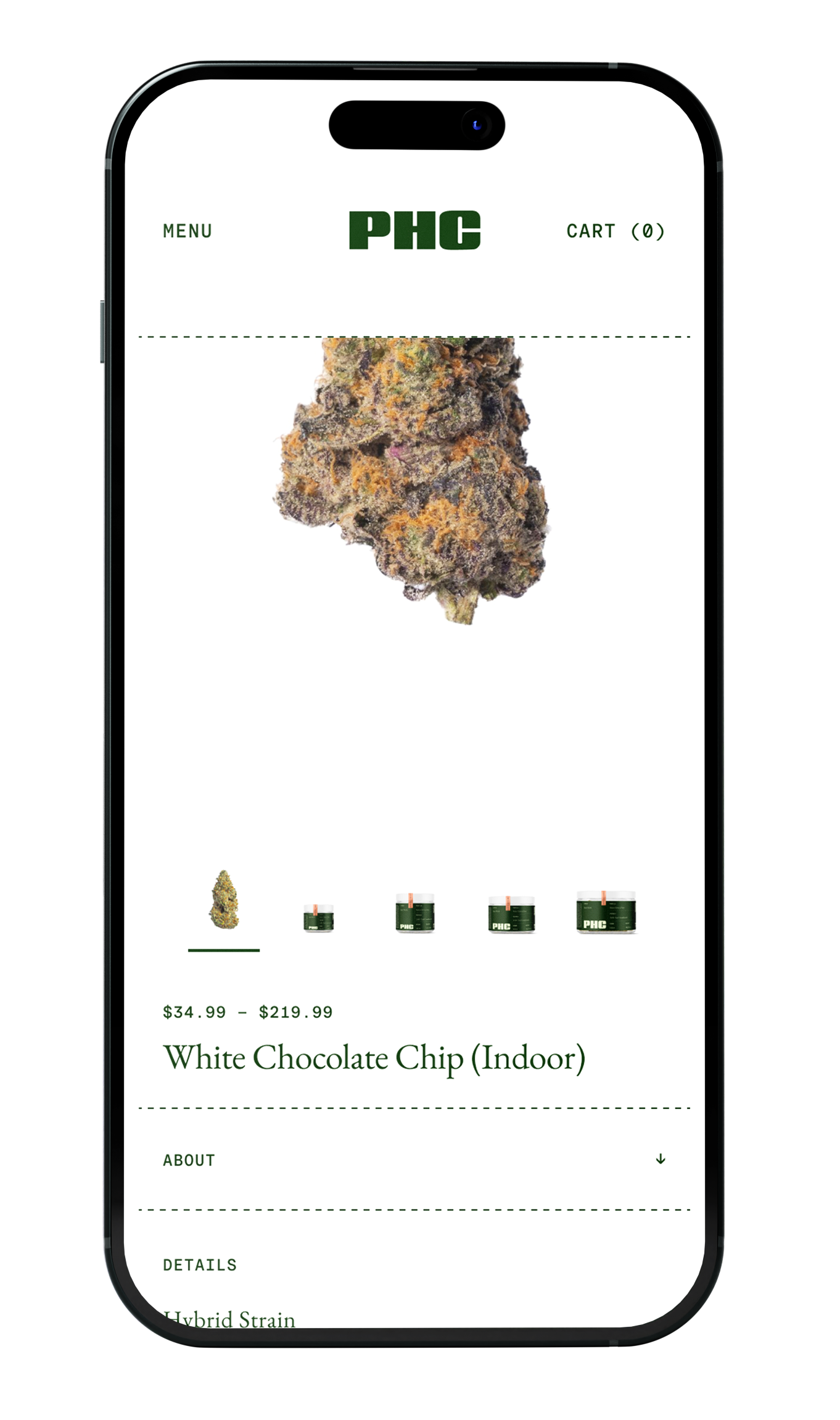
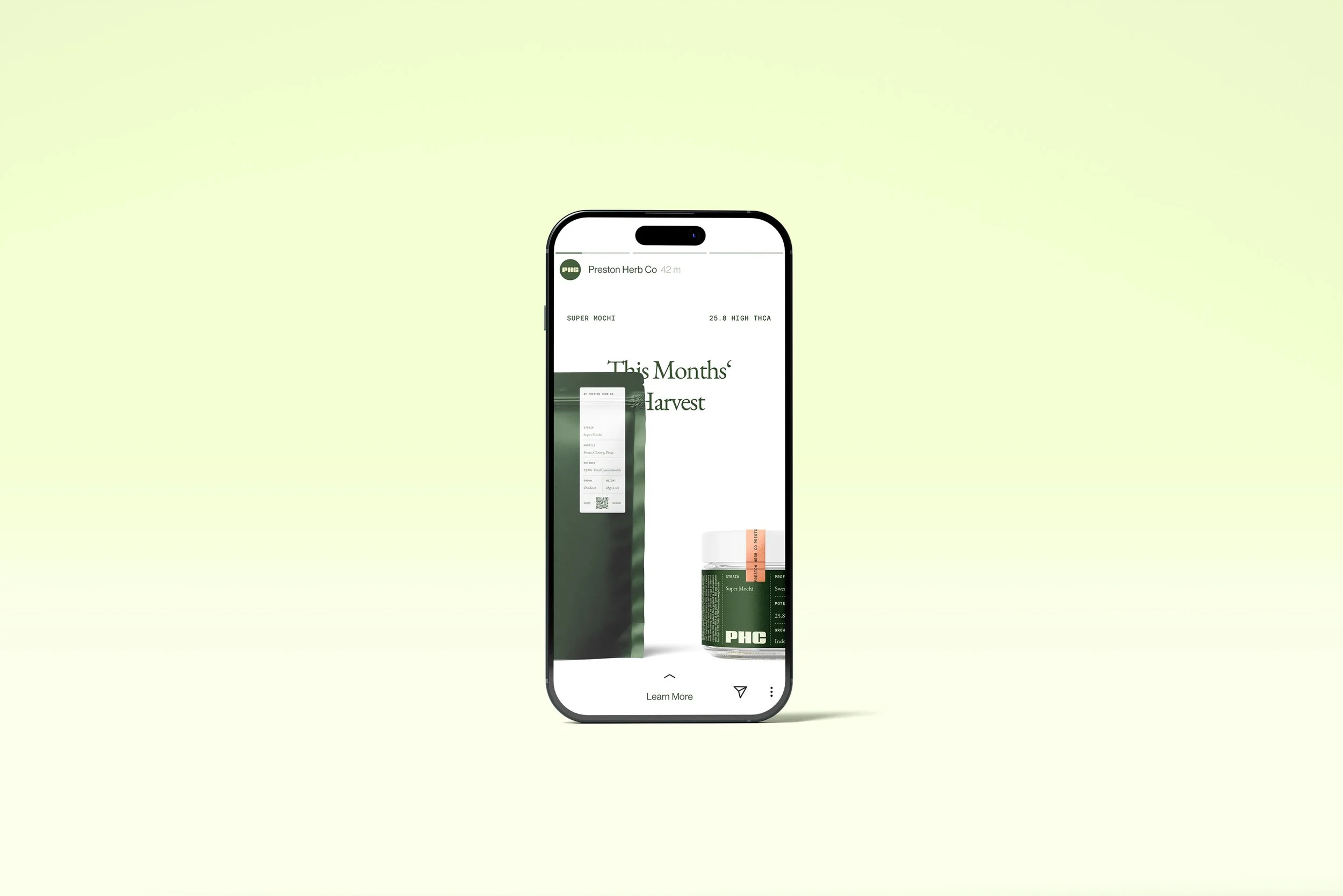
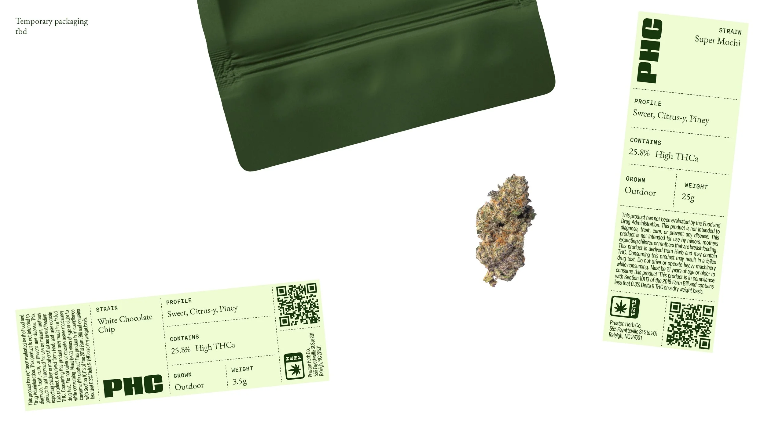
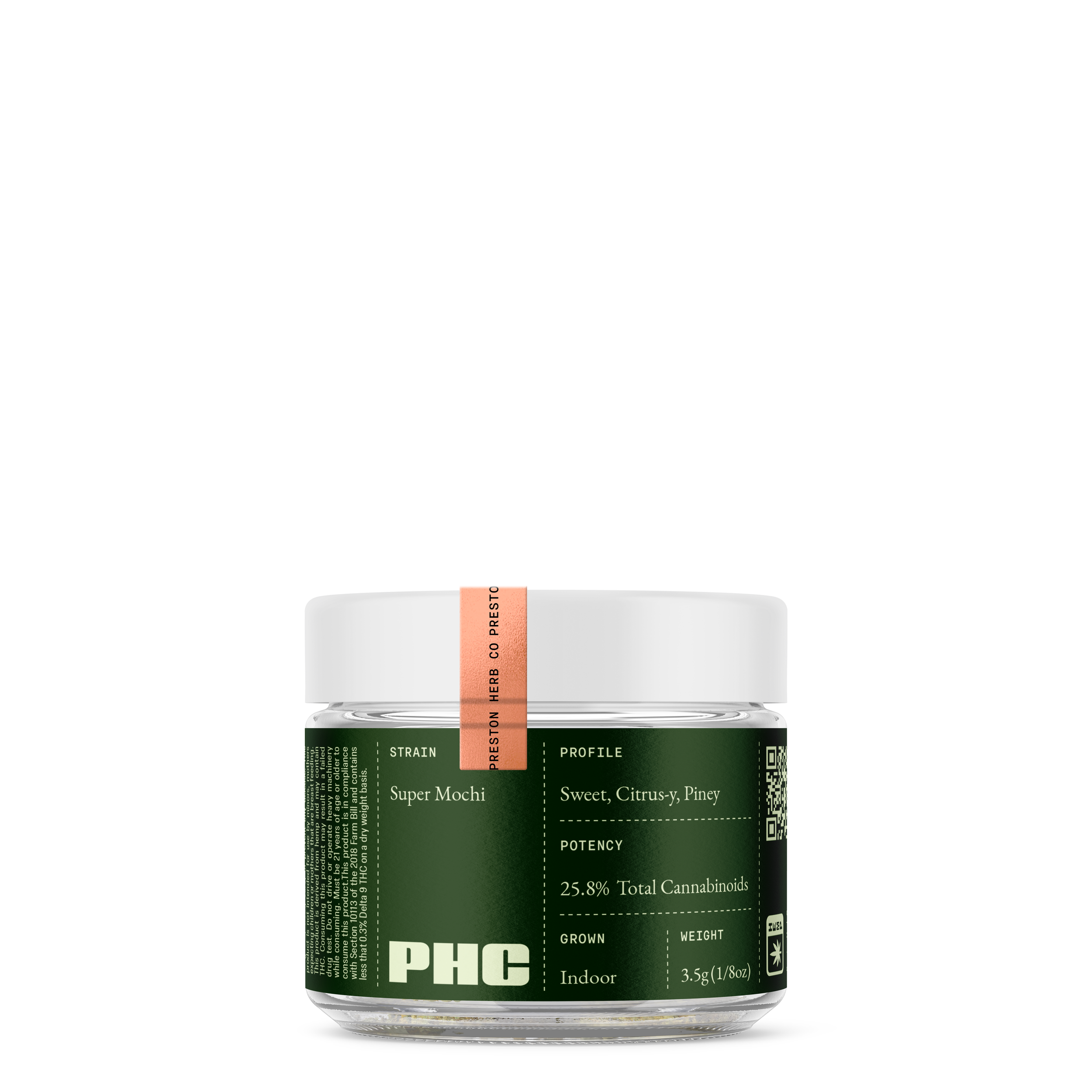
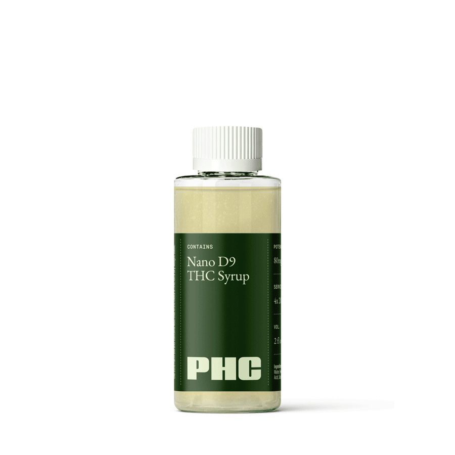
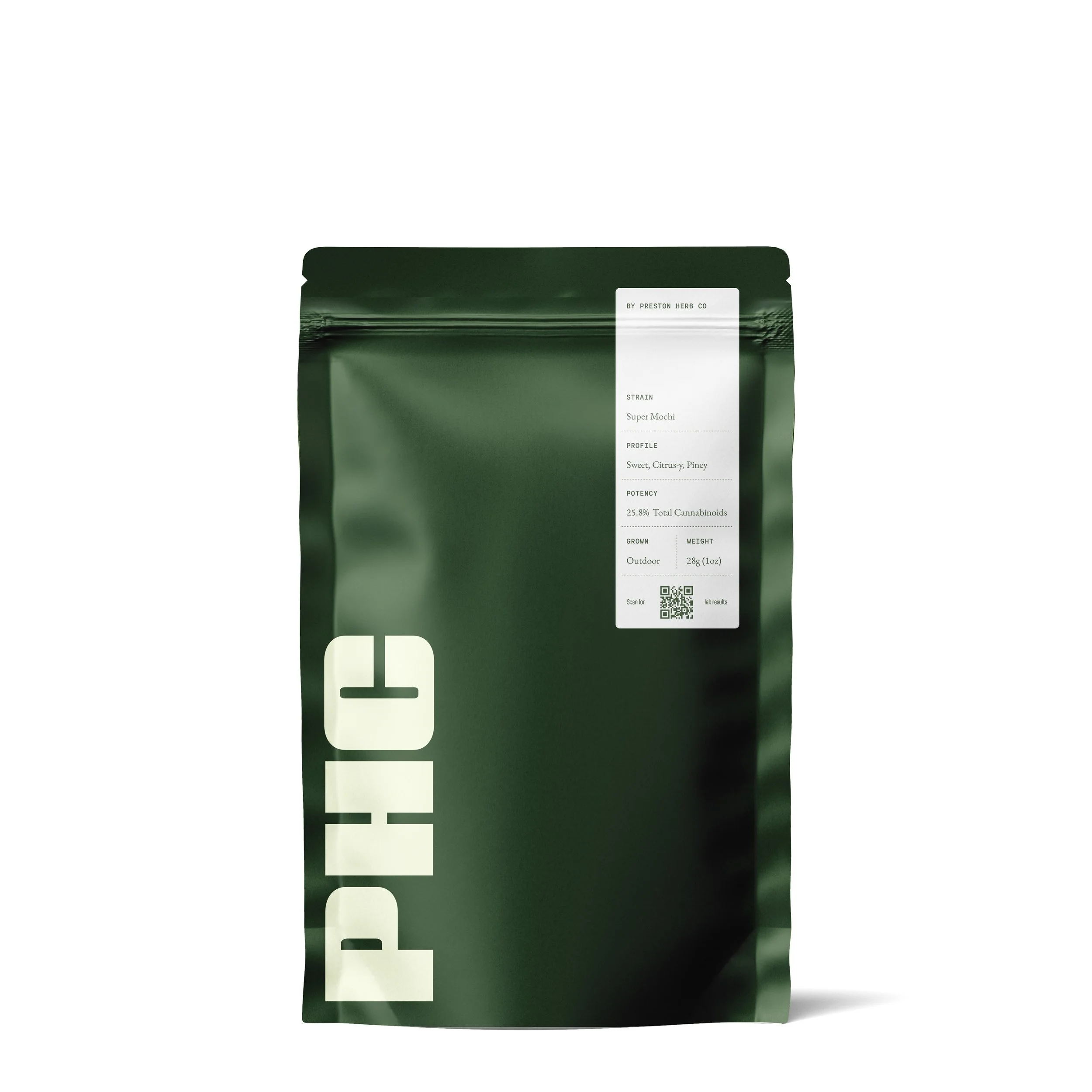
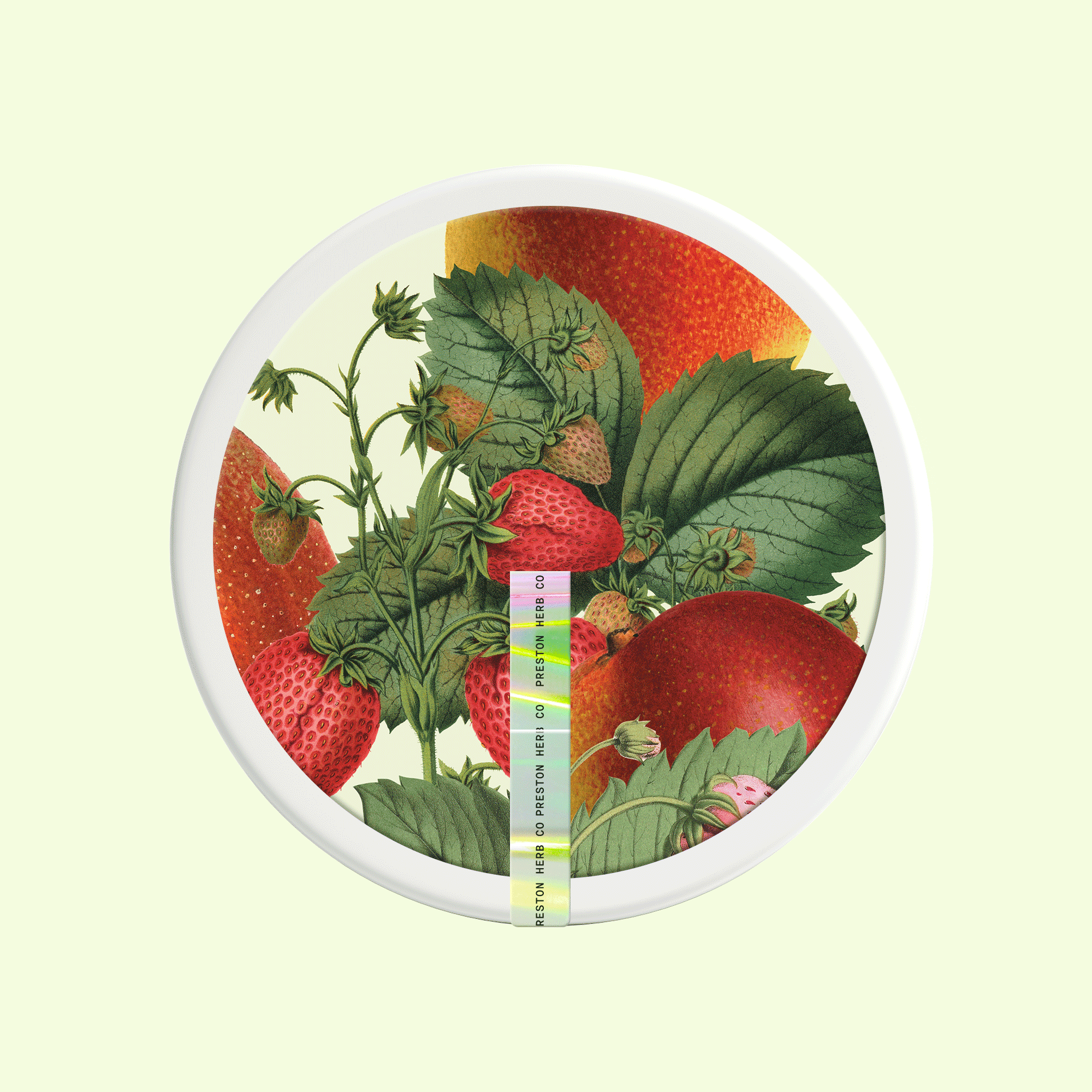
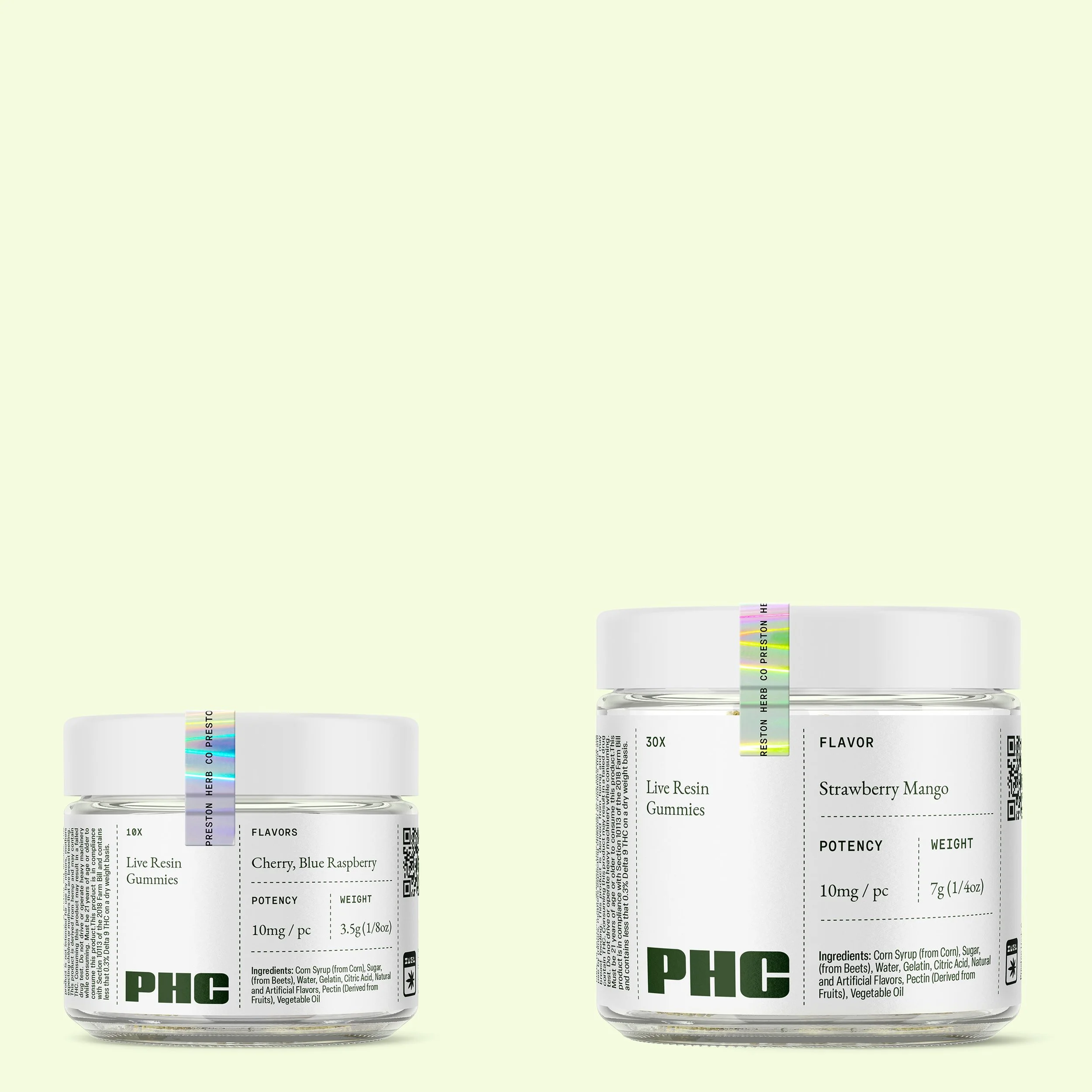
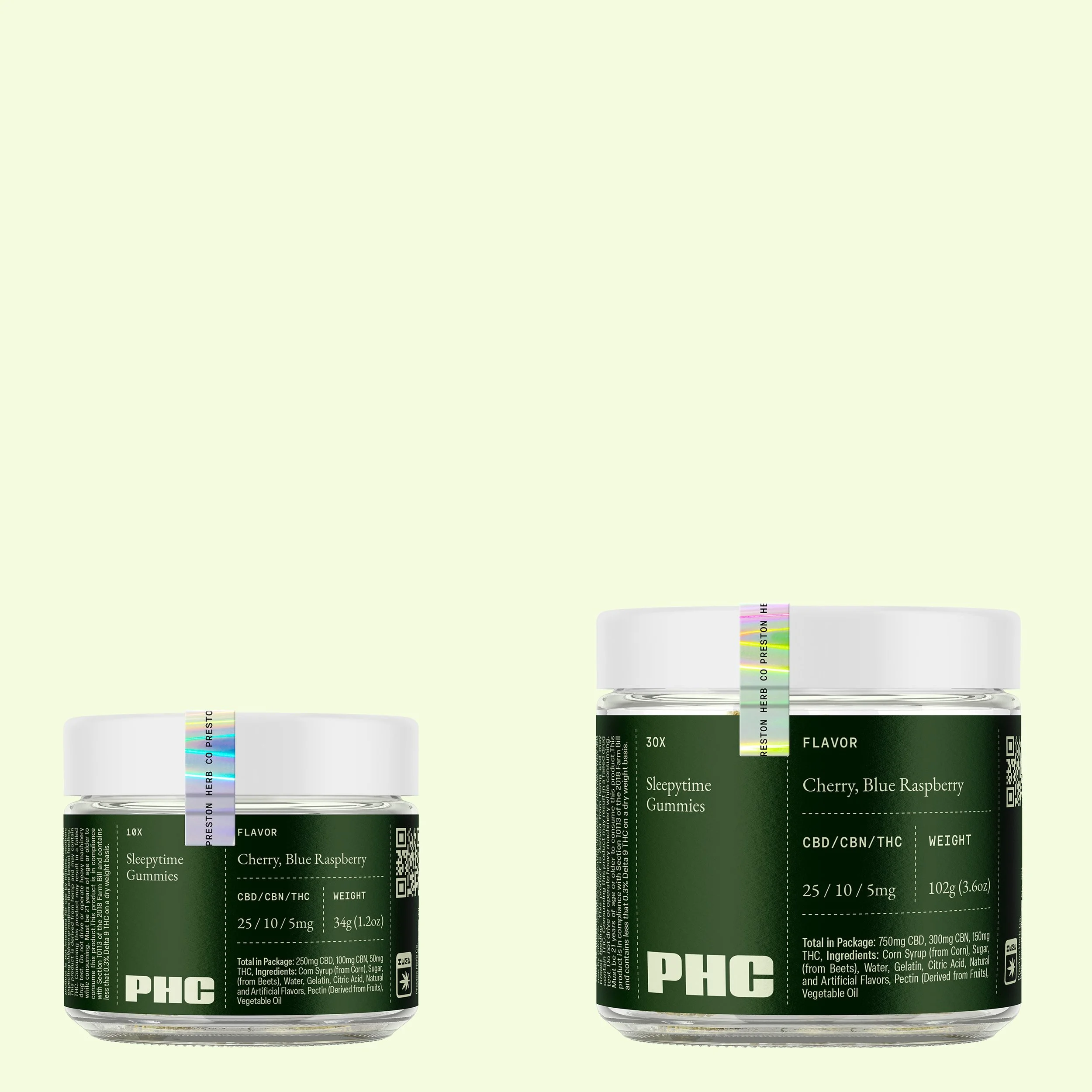
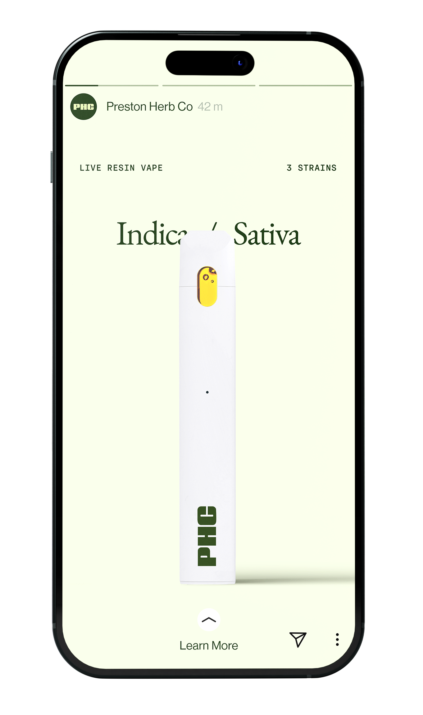
Packaging
Simple 2-color prints and a modular grid helps cater to all of PHC‘s packaging needs — from labelled jars, carton boxes and pouches, while making sure the brands product offerings can be scaled with ease and appeal to a wide audience. Vintage illustrations and collages add depth and differentiation where needed.


Socials
To offset the stronger characteristics of the branding our general approach to layouting is reductionist and polished, based on simple structures and grids that leave room for subtle and deliberate imperfections, providing the brand with a touch of warmth.

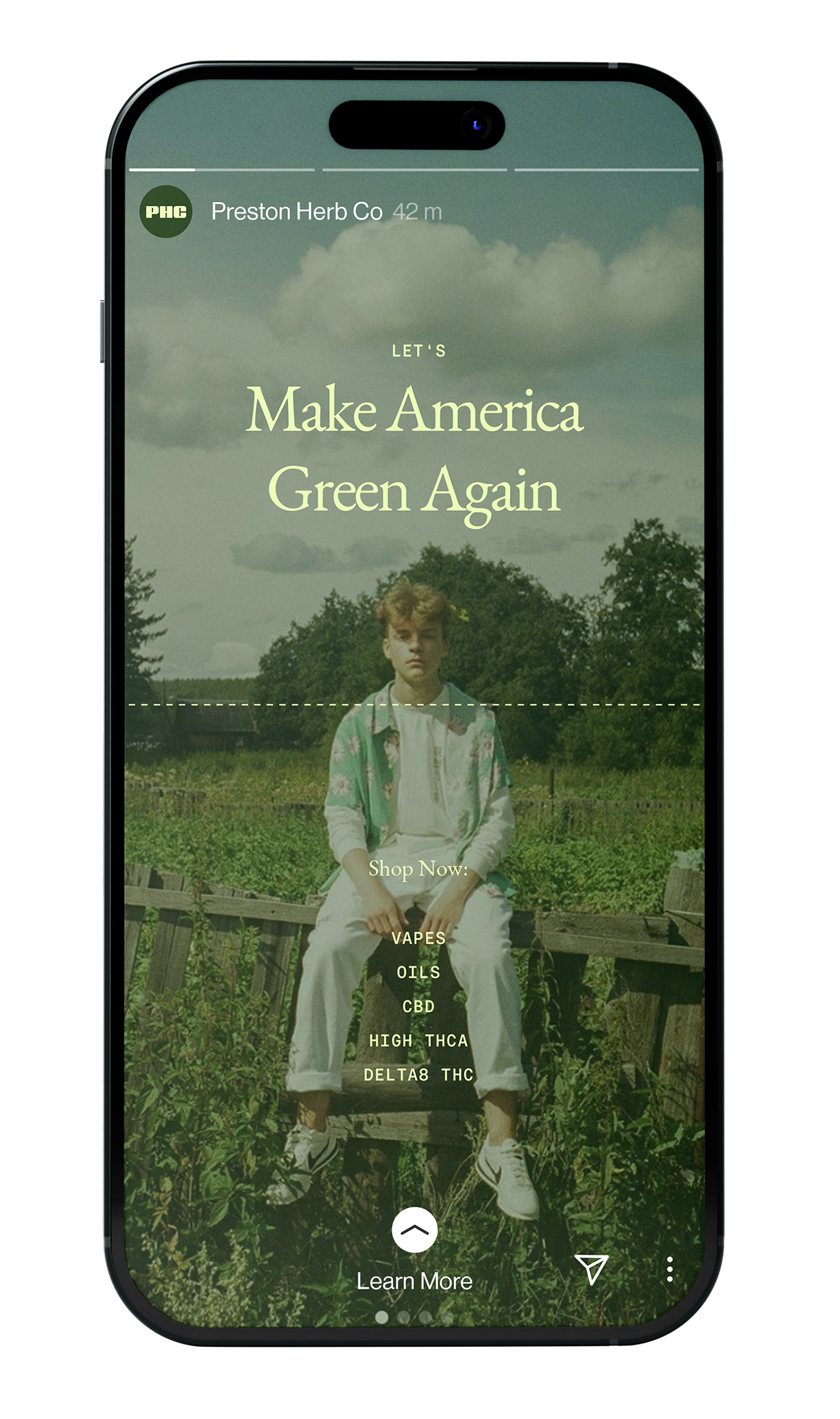
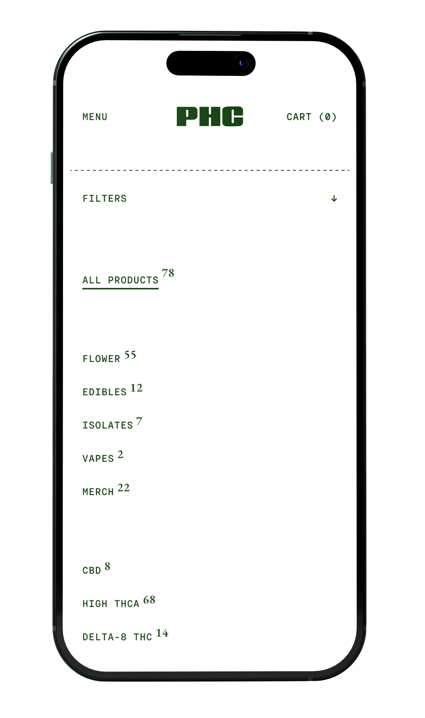
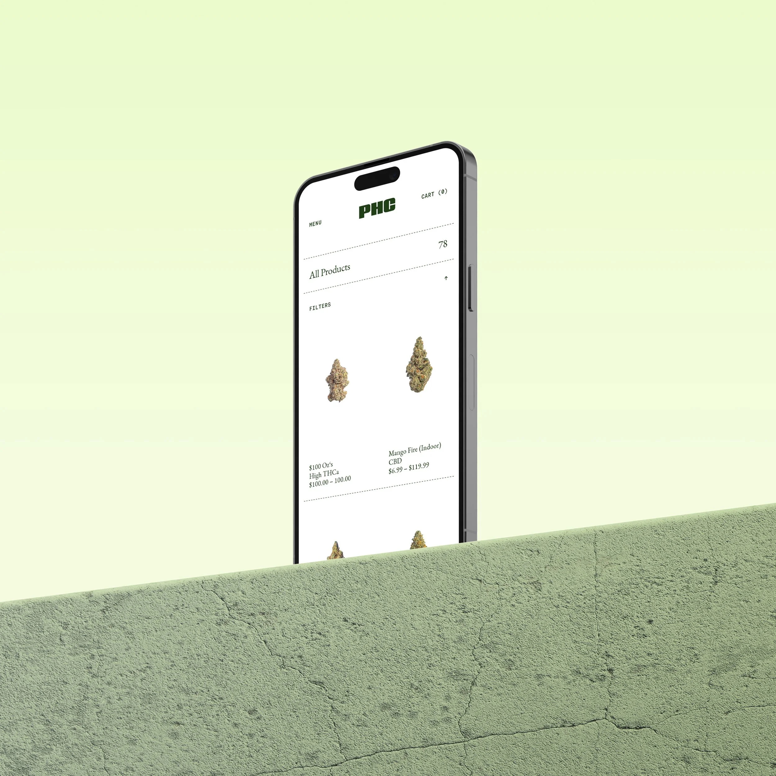
UI / UX
Online we are combining immersive story telling through emotive visuals with a clean shopping interface that balances a premium with a minimalist feel. Our typography is at most times understated, giving center stage to products and visual content. A straight forward modular approach to the overall build makes maintenance and expansion a breeze.